Studio Musings
Showing posts with label self-publishing. Show all posts
Monday, October 31, 2016
Time for a New Start
This has been a very introspective year for me. I've found it hard to write, hard to bead, hard to do a number of things I used to love to do. I know that many of my friends in the blogosphere have had similar issues. For me, some of it has been health-related. This spring we were finally able to determine what's been causing my autoimmune issues and to find a solution. Followed by the waiting while the arthritis and tendonitis eased up enough to allow me to bead again. Much of it was mental. You know how it is; where you have no trouble coming up with great ideas while laying in bed in the early morning. But by the time you're up, showered and ready to face the day, those grand ideas have faded into the background, pushed down by the multitude of 'must-dos' that love to crowd in, pushing everything else back into the 'Tomorrow' category. Why is it that the things we love most seem to be the first to get pushed back into 'Tomorrow'?
I've asked myself a lot of questions, including why I've found it so hard to find the energy to blog, when it used to be such fun, almost a necessity. Here are some of my realizations.
It's interesting how good intentions, or at least my intentions to be a 'real', professional, businessperson can twist and turn in one's head. Back when I first started writing, I posted anything and everything to my blog. Works in progress, snippets of tutorials I was writing; pretty much anything I was working on or that caught my eye was potential fodder for a blog post.
Then, as I became more focused on publishing my books and tutorials, I was encouraged to hold things back, to keep them "secret" until publication. This seemed to make a lot of sense, and most authors do this, so why shouldn't I? But I'm not good at keeping secrets, I don't enjoy keeping secrets, not about things that excite me. I started writing because I love the give and play of sharing ideas. My books and tutorials were and are a direct outgrowth of that love.
Holding a project back until it's published, (or until it's made its rounds on the the teaching circuit) might make a lot of sense from a professional perspective. But it's not fun, and by the time I COULD write about it, some part of me felt like I was breaking a taboo by doing so. I've found it's very hard for me to give myself permission, once that permission has been denied for too long. When I did finally try to write about whatever project it was in my blog, I felt like I was writing marketing copy. Many of these posts fizzled and died before they ever saw the light of day. My blog became more and more random, less and less frequent. Notable exceptions included my Happy Fish bead embroideries, which I started just for myself, just for fun, with no expectations of tutorials. The funny thing is, they became one of my more popular classes this past year. Hmm....
So, what does this all mean? Why am I writing this?
As the title of this post states, I've decided to make a new start and go back to the basics of why I create, why I write. To recover my delight as an artist-explorer, a bead bushwhacker, as someone who's willing to ask 'what happens if' and then dives in, simply because I'm curious, because I want to see what will happen. To once again become someone who's willing to embrace the challenge, play and adventure of creating simply for the sake of creation. Someone who's willing to share whatever answers I might discover. Just because.
Towards that end, I'm planning to spend November going through my backlog of tutorials. It's amazing how many tutorials I abandoned in the half-way stage, or simply never published because I was 'saving' them for the teaching circuit. I expect that you'll see several 'new' tutorials available in my Etsy shop by December.
I've also decided to stop producing beading kits for the the time being. This week I'm going to inventory all of the bead kits that I have currently ready, and I plan to offer them first to my newsletter subscribers. Any that are left, I'll post to my Etsy store by mid-November. Once they are gone, they may be gone for good. Right now I only foresee making new kits for specific classes or workshops, but that's something I'll address if and when it comes up.
And after that?
Well, November is Nanowrimo and I plan to jump into the fray for the first time in several years. I still need to figure out what I'm writing about - this year I'll definitely earn the 'Pantser' badge. Are you planning to write for Nanowrimo? If you are, let me know. Perhaps we can become writing buddies and help spur eachother on to victory (or at least 50,000 words)! :-)
I'm also planning to write about my most recent travels, and some of my play time in other mediums - including my latest designs for my Cricut paper-cutting machine.
And yes, I'm still beading. In particular, I'm continuing to work on a 3D, freeform peyote, juvenile Rosy Rockfish (pictures of this project to come in another post). Once he's done, I have this idea in my head to make a whole series of life-size beaded fish. It's been swimming around in this head of mine for forever, and it seems like it's about time to dive in.
So those are my plans. We'll see how it goes....
Tuesday, June 7, 2016
A New-to-me Option for Bead Illustration Software
| Graphic - vector illustration and design by Indeeo, Inc. |
I love Adobe Illustrator. It's been the gold standard for vector-based graphic design and illustration for years, for good reasons. But it also costs a pretty penny. I'm lucky enough to own an old copy of Adobe Creative Suite 6 (CS6), purchased right before they moved to a subscription model. These days, the single-app license for Illustrator is $19.99/month if you don't happen to be a student or teacher. The price makes it really hard for me to recommend it to other indie designers. I also worry about what I'll do when my current version of CS6 gets too old and glitchy to work with the latest operating systems on my computer. Sooner or later, it's bound to happen.
This means I'm always on the look out for a solid, low-cost alternative. Last night, I think I may have found one, designed for the iPhone or iPad. Searching for 'vector-based illustration software', I came across a review for Autodesk Graphic, by Indeeo, Inc for iOS. Comparing the feature set from the reviews to the latest feature set in the product description in the App store, I decided it was worth the $8.99 pricetag to give it a test drive. Doing research for this blog post this morning, I found that different links have different pricing, from $2.99 - $29.99. One thing to note - the link for $2.99 seems to be for an earlier version of the program (version 1.01, as opposed to 3.1) - so I wouldn't recommend it.
Why do I like Graphic, besides the pricetag?
![]() |
| Bead Sample page: trying out the shape tools and gradient fills |
The interface is very intuitive for anyone who's familiar with Illustrator or other drawing software. They also have a really nice series of tutorial pages to quickly bring you up to speed on the tools and workspace.
It's quick
I worked up this little beading sample page within about 20 minutes of downloading the program, that includes reading through the tutorial pages.
It has the tools I need
I have very specific things I want to accomplish. Can I make pretty looking 'beads' quickly? Can I easily add a radiant fill, and change line and fill colors? How about adding in the thread paths? Does it have layers for additional control? Early experimentation indicates that Graphic meets all of these needs, hands down.
It's vector-based
This last one may need a little more explanation. In a nutshell, the question is whether lines are rendered as a series of little dots that all happen to connect, or as a continuous line described by a mathematical algorithm. The later creates smooth, beautiful curves no matter how much you scale the original image. Here's an example to show the difference:
![]() |
| Zooming in on a .JPG and a .SVG file |
For this, I exported my Bead Sample page in two separate formats, first as a .JPEG, then as a .SVG (which is a vector-based file format). I opened the .JPEG in Photoshop, then zoomed in to 500% on one of the beads. This is the left-hand sample, and you can already see the pixellation along the outer edges of the shape. I then opened the .SVG file in Illustrator, and zoomed in 800% on the same bead. This is the right-hand sample; see how nice and smooth the edge looks? The very slight pixellation you may notice is because I combined the two samples and text in Photoshop, then reduced the size and saved them as a .jpg so that they'd download more quickly over the Internet.
That's the key with bead illustrations - drawn them in a vector-based program, then export them in the size and format you need for your particular purpose. While, of course maintaining your original, vector-based files as your originals.
It Exports into Multiple Formats
I touched on this above, but it's worth pointing out again. Besides JPEG and SVG, you can also export into PDF, PSD and PNG, as well as a Graphic source file (useful if you're moving between devices).
It supports the iPad Pro and iPencil
All the experimenting I did last night was curled up on my couch. Drawing with the iPencil on my iPad, is a night-and-day experience compared to working with a mouse. But even if you don't have an iPencil, I had a lot of success with simple touch gestures, and still found it much easier than working with a mouse.
Could be used to Layout Single-Page Tutorials
Graphic, like Illustrator, is designed for single-page designs, not multi-page books. However, within those limitations, it offers a lot of control for page layouts combining illustrations and text. In fact, their beautifully-done Intro Guides were all created using the program.
------
So, will Graphic replace Illustrator in my workflow? I'll have to see as I do more experimentation. At this point, I'm guessing that I'm going to use it to augment how I use Illustrator. At the very least, it's fun to use and will allow me to work in situations where dragging along a laptop simply practical. If you decide to check out Graphic for yourself, I'd love to hear what you think!
In the meantime, I'm still looking for a viable, lower-cost alternative to Adobe's InDesign for page layout and design.
Tuesday, December 1, 2015
New PDF Tutorial: Criss-Cross Lantern Beads with Right Angle Weave
Preparing for a workshop early last month, I pulled out the pattern for my Cap Beads from my book Corsets, Caps & Stays: Elegant Beaded Beads. What would happen, I wondered, if I used some of the fun, shaped beads that have come out since then? My new Criss-Cross Lantern beads are the result.
I promised my students that I'd send them the revised instructions, including this variation. And here it is, nearly a month later! I've heavily revised the original pattern, doubling the number of detailed bead diagrams and added all-new instructions for the Lantern Bead variation.
The Lantern Ornaments Beaded Beads PDF pattern is now available in my Etsy store. To celebrate its release, I'm offering a special deal.
2015 Holiday Special
** If you purchase a copy of my original Corsets, Caps & Stays book (either paperback or digital versions) now through December 15th, I will include the download code for my Lantern Bead PDF tutorial with your purchase.
** Also, for friends who already own a copy of my original Corsets book and are on my mailing list, my next newsletter update will include instructions for how you can claim your free copy of this new pattern.
To simplify my life, I've decided to post all free updates via my email newsletter from now on. There's only one of me and trying to keep track of who purchased what, from where, and when gets to be sooo crazy, especially since I have no way of tracking Amazon sales. Trying to track everything takes up a tremendous amount of time that I could otherwise use for designing, beading and writing. From now on, I'll post update opportunities in my email newsletters, along with simple instructions on how to claim your PDF updates for my patterns that you've previously purchased.
Not on my mailing list? Click here to sign up. Normally I send out one to two email updates per month, sometimes a little more, sometimes a little less. It all depends on what's going on.
This month, I've decided to get ambitious! My plan is to send out a special update every Wednesday, starting tomorrow for the next three weeks, with a new pattern addition or update code. If you already own the base pattern (or purchase it during my promotion), you'll receive the updates for free. Next week I'll be sending out an addition to my Snowflakes and Stars tutorial. This is my way of saying thank you for helping to make it possible to do what I do!
I promised my students that I'd send them the revised instructions, including this variation. And here it is, nearly a month later! I've heavily revised the original pattern, doubling the number of detailed bead diagrams and added all-new instructions for the Lantern Bead variation.
The Lantern Ornaments Beaded Beads PDF pattern is now available in my Etsy store. To celebrate its release, I'm offering a special deal.
2015 Holiday Special
** If you purchase a copy of my original Corsets, Caps & Stays book (either paperback or digital versions) now through December 15th, I will include the download code for my Lantern Bead PDF tutorial with your purchase.
** Also, for friends who already own a copy of my original Corsets book and are on my mailing list, my next newsletter update will include instructions for how you can claim your free copy of this new pattern.
To simplify my life, I've decided to post all free updates via my email newsletter from now on. There's only one of me and trying to keep track of who purchased what, from where, and when gets to be sooo crazy, especially since I have no way of tracking Amazon sales. Trying to track everything takes up a tremendous amount of time that I could otherwise use for designing, beading and writing. From now on, I'll post update opportunities in my email newsletters, along with simple instructions on how to claim your PDF updates for my patterns that you've previously purchased.
Not on my mailing list? Click here to sign up. Normally I send out one to two email updates per month, sometimes a little more, sometimes a little less. It all depends on what's going on.
This month, I've decided to get ambitious! My plan is to send out a special update every Wednesday, starting tomorrow for the next three weeks, with a new pattern addition or update code. If you already own the base pattern (or purchase it during my promotion), you'll receive the updates for free. Next week I'll be sending out an addition to my Snowflakes and Stars tutorial. This is my way of saying thank you for helping to make it possible to do what I do!
Wednesday, July 8, 2015
Lessons Learned: Setting up a Book Project in InDesign
I plan to get technical in this Lessons Learned post. If you're thinking about producing your own self-published book, then I hope this will be useful to you. Otherwise, I'm hoping that it might give you a behind-the-scenes look at the less glamorous side of the process.
I use InDesign by Adobe for the layout of all my book projects, including my shorter PDF tutorials. While there are other tools available, I appreciate InDesign's power and versatility. The only limit to what you can produce are one's own capabilities. The good news is, I've found that you can start with a few basic tools, and learn from there as needed to achieve your desired results. I read and watched more than a few internet tutorials over the course of this project!
Creating a New InDesign Document
The New Document Dialog Box:
This is the same set-up I used for Explorations. There are three choices under "Intent": Print, Web, or Digital Publishing. I always choose Print as my default because it requires the highest resolution. It's easier to reduce resolution later for other publication channels than to increase it.
I started with 150 pages, which was my initial page-count goal. it's easy enough to add pages later. I've heard it suggested that you break your document into smaller files so that it doesn't 'bog down' as you work. I kept mine as one document, but this likely depends upon your individual setup.
Note that the inside margin is larger than the top, bottom or outside. This is to prevent the book's contents from disappearing into the ditch of the binding. Because I planned to have some of my images bleed off the edges of the page, I added a bleed margin. Making sure that each image extends at least .125 inches off the edge leaves room for trimming errors at the printers.
When I click okay, my new, blank document appears:
I've opened the Pages control panel at top right to show a quick overview of my document's pages. At the bottom of the image, I've noted the bleed, page and margin guidelines.
Setting up Page Masters
Next, I recommend setting up Page Masters. You can use Masters to create uniform layout grids and add page numbers or any other information that you wish to repeat over multiple pages. For Explorations, I created separate masters for Chapter Heads, as well as One, Two and Three-Column layouts. I also used the masters to display the page numbers.
If you look closely at this screenshot of a two-page/three-column Master from the final file for Explorations, you'll see thumbnails of the populated pages from the book. As you add information to each page, it will show up in the thumbnails.
With my first book, I also used masters to list the chapters' titles on each page within the chapter. The chapter titles are outlined in orange in the screenshot because I don't have the font I originally used on this computer. One of those unfortunate quirks from having to purchase a new computer when the old one dies - always a few things that didn't transfer over. But InDesign tells me which font I used, so I can purchase a new license, should I so choose.
Building Font and Paragraph Styles
Now that I have my Page Masters set up, it's time to set up my Font and Paragraph Styles. I touched on this in my last Lessons Learned post. Before I began active work on the page layouts, I put together a cheat sheet of all of the font styles and colors I planned to use. To make it easier to reference, I stored the info as a separate Master in my InDesign file.
Then it's time to actually set up the Paragraph Styles by specifying the font, size, leading, color and more for each of your text blocks.
I set up separate styles for each level of text: Titles, Chapter Heads, Section Heads, Body Text, etc.
Once you set up each of your Paragraph Styles, the control panel let's you easily format blocks of text. Simply select the text you want, then click on the style you want. Your text is instantly styled with your presets. It takes time to set up all of the paragraph styles - I spent the better part of two days tweaking things to make sure I had what I needed. But speaking from experience, they can literally save you days and weeks worth of time once you start working on the page layout!
Ready to Rock
Whew! At long last, after nine Lessons Learned posts, we are finally at a point where I can start talking about page layout in the next post. I'll share my iterative process and how I work to put all the pieces together into a cohesive whole, at least when all goes right! Thanks for joining me on the recap of this journey.
Have any questions about masters or paragraph styles? Let me know!
I use InDesign by Adobe for the layout of all my book projects, including my shorter PDF tutorials. While there are other tools available, I appreciate InDesign's power and versatility. The only limit to what you can produce are one's own capabilities. The good news is, I've found that you can start with a few basic tools, and learn from there as needed to achieve your desired results. I read and watched more than a few internet tutorials over the course of this project!
Creating a New InDesign Document
The New Document Dialog Box:
![]() |
| New Document dialog box |
This is the same set-up I used for Explorations. There are three choices under "Intent": Print, Web, or Digital Publishing. I always choose Print as my default because it requires the highest resolution. It's easier to reduce resolution later for other publication channels than to increase it.
I started with 150 pages, which was my initial page-count goal. it's easy enough to add pages later. I've heard it suggested that you break your document into smaller files so that it doesn't 'bog down' as you work. I kept mine as one document, but this likely depends upon your individual setup.
Note that the inside margin is larger than the top, bottom or outside. This is to prevent the book's contents from disappearing into the ditch of the binding. Because I planned to have some of my images bleed off the edges of the page, I added a bleed margin. Making sure that each image extends at least .125 inches off the edge leaves room for trimming errors at the printers.
When I click okay, my new, blank document appears:
![]() |
| The blank document, with a toolbar to the left and control panels to the right |
I've opened the Pages control panel at top right to show a quick overview of my document's pages. At the bottom of the image, I've noted the bleed, page and margin guidelines.
Setting up Page Masters
Next, I recommend setting up Page Masters. You can use Masters to create uniform layout grids and add page numbers or any other information that you wish to repeat over multiple pages. For Explorations, I created separate masters for Chapter Heads, as well as One, Two and Three-Column layouts. I also used the masters to display the page numbers.
![]() |
| Setting up a 3-column master, and the Pages dialog box |
![]() |
| A master from my first book. Each chapter title appeared on its pages. |
Building Font and Paragraph Styles
Now that I have my Page Masters set up, it's time to set up my Font and Paragraph Styles. I touched on this in my last Lessons Learned post. Before I began active work on the page layouts, I put together a cheat sheet of all of the font styles and colors I planned to use. To make it easier to reference, I stored the info as a separate Master in my InDesign file.
![]() |
| A reference 'cheat' sheet for the book's font styles and colors |
Then it's time to actually set up the Paragraph Styles by specifying the font, size, leading, color and more for each of your text blocks.
![]() |
| The left-hand menu allows you to fully customize each Paragraph Style |
![]() |
The Paragraph Styles Control Panel with my presets |
Once you set up each of your Paragraph Styles, the control panel let's you easily format blocks of text. Simply select the text you want, then click on the style you want. Your text is instantly styled with your presets. It takes time to set up all of the paragraph styles - I spent the better part of two days tweaking things to make sure I had what I needed. But speaking from experience, they can literally save you days and weeks worth of time once you start working on the page layout!
Ready to Rock
Whew! At long last, after nine Lessons Learned posts, we are finally at a point where I can start talking about page layout in the next post. I'll share my iterative process and how I work to put all the pieces together into a cohesive whole, at least when all goes right! Thanks for joining me on the recap of this journey.
Have any questions about masters or paragraph styles? Let me know!
Thursday, June 18, 2015
Lessons Learned: Thinking about Book Design
In earlier posts in my Lessons Learned series, I've talked about how I organize my book projects, from developing my outline to using Scrivener software to collect all of my text and research into one place. As you collect the materials you'll need to produce your book, it's a good time to consider your publishing options.
Choose Your Publishing Path
You could decide to contact the major publishers to see if they are interested in your project. If your project is accepted, there are definite benefits to going this route. Working with a major publisher, you have a sounding board for your ideas and the support of an entire editorial team working to make your book the best book possible. Most of the major craft publishers, like Lark Books and Interweave, have submission guidelines available on their website. I tried this route back in 2008-2009, sending out several submission proposals for my first book on freeform peyote beading. When I never heard back, I started down the path of self-publishing.
All of the books I have written so far are self-published. Back in 2011 I wrote a post about my reasons for taking this route to publication; rereading the post, everything still applies. I've found that self-publishing gives me the greatest editorial control over the content, allowing me to produce the books I want to produce. But self-publishing also means a lot more heavy lifting on the author's part to create the most polished, professional book that you can. Each book I've produced has been a learning process, and each book has benefited from my earlier works.
Gathering and Sorting the Pieces of the Puzzle
For me, producing the book is like putting together the pieces of a several, thousand piece puzzle, made trickier because when I begin, I'm not sure if I:
A) have all of the pieces - often specific projects are incomplete, or still simply ideas, when I begin work on the page layout.
B) have pieces to more than one puzzle - invariably some of my ideas from brainstorming must be left on the cutting room floor (or saved for another project) to produce a cohesive book, but that's not always apparent in the beginning.
While I continue sorting and gathering, I start working on my next step - deciding upon the specifics of the 'look and feel' of the book I want to produce.
Developing your personal Page-Layout Reference Library
Look at Your Favorite Craft Books
My goal is always to produce as professional a finished product as I can. This means my book needed to have a cohesive layout that is visually appealing and makes it easier to access the book's information. One of the most effective methods I've found to develop my own 'look and feel' guidelines is to study some of my favorite craft books from other media.
Go to the library (or your bookshelves) and choose 3-5 books that you think are both beautiful and extremely useful. It's safest to use a non-related media so that it's easier to focus on the overall 'look and feel' without getting lost in the information.
Looking through your selections, use these criteria as a study guide:
1) Overall Book Dimensions: What are the outside dimensions of the book? 8 1/2" x 11" tends to be the most common size for craft books in the US these days. If your book is a different size, how does that difference affect its visibility on the bookshelf? How does the size affect its readability/usability at the craft table?
2) Typography: What fonts do they use, and how do they use them? Most books use different fonts for the chapter headings than the main text blocks. What fonts do they use and where? Most books use two or more fonts; a serif or sans-serif font for the main text blocks, and possibly a bolder or more decorative font for chapter headings. Are the fonts serif, sans-serif or decorative? Do you like the fonts? Why or why not? What are the font's physical sizes relative to the page, and to each other? Make notes on what you see.
3) Margins and Whitespace: What are the books margins? Do the margins differ for the first page of each chapter from interior pages within each chapter? Look at both exterior margins - the white spaces around each page, and the interior margins - the spacing between headers, sub-headings, and body text. Also look at the white space separating text from photographs. Do the pages feel crowded, sparse, or just right?
4) Columns: How is the information on each page divided? Do they use multiple columns? How many columns? Do all pages have the same number of columns? If no, what are the different column layouts? How did the author/layout editor use the columns to help present the information? What is the white space between columns?
5) Images: Where do the images appear on each page? Do the images fit within the exterior margins, or do they extend all the way off of the edge of the page? When images stretch to the edge of the page without margins, this is referred to as "full-bleed" or "bleed". Note that not all print-on-demand-publishers offer full-bleed printing capabilities, and it may cost extra to produce a book with full-bleed photography. Older craft books made more use of black and white photography due to printing costs; it still costs more to print with color, but it's not as prohibitively expensive.
Most craft books will include both process photos and more polished photos of finished pieces. What background do they use for the process photos? How do the backgrounds in the finished pieces differ?
6) Illustrations: How does each book balance the use of photographs versus illustrations in describing their process? Are their illustrations clear and easy to understand? What would make them easier to understand? What do you like best about the illustrations, what do you like least?
Make photocopies or take pictures of some of the pages that you can print and scribble on about what you like and dislike. Your goal here is to better understand how other authors and editors have used these basic elements of book design to convey their message. Unless you are already comfortable with a page layout program, don't worry about developing your own templates at this point. Just make clear notes about the elements that you might like to use in your book. I often draw little sketches blocking out sections and pages.
Some of my favorite books for recent study include Complex Cloth by Jane Dunnewold; Paper, Metal and Stitch by Maggie Grey; and Color on Paper and Cloth by Ruth Isset. They are all amazing technique books by authors whose work I truly admire.
Short Bibliography of Books about Typography, Layout and Design
I combined these studies with a couple of books specifically on page layout, developing my own 'course' in book design and page layout. Here's a quick list of some books you might find useful (I was able to check most out of my public library):
I've found that the time spent developing the design framework for each book project helps me to stay on track later. It's another way of thinking about and organizing the information; a way of looking at the forest rather than the individual trees. I don't always manage to follow my rules, but at least they are there as a guide!
This is my eighth post in my Lessons Learned series, about my experiences with self-publishing my latest book. Right now, I plan to talk about how I set up my book project using InDesign in my next post. But I'd love to hear from you: what would you like to see? Have you found this series useful? Are there specific topics you're hoping I'll cover? Inquiring minds definitely want to know.
cheers!
Choose Your Publishing Path
You could decide to contact the major publishers to see if they are interested in your project. If your project is accepted, there are definite benefits to going this route. Working with a major publisher, you have a sounding board for your ideas and the support of an entire editorial team working to make your book the best book possible. Most of the major craft publishers, like Lark Books and Interweave, have submission guidelines available on their website. I tried this route back in 2008-2009, sending out several submission proposals for my first book on freeform peyote beading. When I never heard back, I started down the path of self-publishing.
All of the books I have written so far are self-published. Back in 2011 I wrote a post about my reasons for taking this route to publication; rereading the post, everything still applies. I've found that self-publishing gives me the greatest editorial control over the content, allowing me to produce the books I want to produce. But self-publishing also means a lot more heavy lifting on the author's part to create the most polished, professional book that you can. Each book I've produced has been a learning process, and each book has benefited from my earlier works.
Gathering and Sorting the Pieces of the Puzzle
For me, producing the book is like putting together the pieces of a several, thousand piece puzzle, made trickier because when I begin, I'm not sure if I:
A) have all of the pieces - often specific projects are incomplete, or still simply ideas, when I begin work on the page layout.
B) have pieces to more than one puzzle - invariably some of my ideas from brainstorming must be left on the cutting room floor (or saved for another project) to produce a cohesive book, but that's not always apparent in the beginning.
While I continue sorting and gathering, I start working on my next step - deciding upon the specifics of the 'look and feel' of the book I want to produce.
Developing your personal Page-Layout Reference Library
Look at Your Favorite Craft Books
My goal is always to produce as professional a finished product as I can. This means my book needed to have a cohesive layout that is visually appealing and makes it easier to access the book's information. One of the most effective methods I've found to develop my own 'look and feel' guidelines is to study some of my favorite craft books from other media.
Go to the library (or your bookshelves) and choose 3-5 books that you think are both beautiful and extremely useful. It's safest to use a non-related media so that it's easier to focus on the overall 'look and feel' without getting lost in the information.
Looking through your selections, use these criteria as a study guide:
1) Overall Book Dimensions: What are the outside dimensions of the book? 8 1/2" x 11" tends to be the most common size for craft books in the US these days. If your book is a different size, how does that difference affect its visibility on the bookshelf? How does the size affect its readability/usability at the craft table?
2) Typography: What fonts do they use, and how do they use them? Most books use different fonts for the chapter headings than the main text blocks. What fonts do they use and where? Most books use two or more fonts; a serif or sans-serif font for the main text blocks, and possibly a bolder or more decorative font for chapter headings. Are the fonts serif, sans-serif or decorative? Do you like the fonts? Why or why not? What are the font's physical sizes relative to the page, and to each other? Make notes on what you see.
3) Margins and Whitespace: What are the books margins? Do the margins differ for the first page of each chapter from interior pages within each chapter? Look at both exterior margins - the white spaces around each page, and the interior margins - the spacing between headers, sub-headings, and body text. Also look at the white space separating text from photographs. Do the pages feel crowded, sparse, or just right?
4) Columns: How is the information on each page divided? Do they use multiple columns? How many columns? Do all pages have the same number of columns? If no, what are the different column layouts? How did the author/layout editor use the columns to help present the information? What is the white space between columns?
5) Images: Where do the images appear on each page? Do the images fit within the exterior margins, or do they extend all the way off of the edge of the page? When images stretch to the edge of the page without margins, this is referred to as "full-bleed" or "bleed". Note that not all print-on-demand-publishers offer full-bleed printing capabilities, and it may cost extra to produce a book with full-bleed photography. Older craft books made more use of black and white photography due to printing costs; it still costs more to print with color, but it's not as prohibitively expensive.
Most craft books will include both process photos and more polished photos of finished pieces. What background do they use for the process photos? How do the backgrounds in the finished pieces differ?
6) Illustrations: How does each book balance the use of photographs versus illustrations in describing their process? Are their illustrations clear and easy to understand? What would make them easier to understand? What do you like best about the illustrations, what do you like least?
Make photocopies or take pictures of some of the pages that you can print and scribble on about what you like and dislike. Your goal here is to better understand how other authors and editors have used these basic elements of book design to convey their message. Unless you are already comfortable with a page layout program, don't worry about developing your own templates at this point. Just make clear notes about the elements that you might like to use in your book. I often draw little sketches blocking out sections and pages.
Some of my favorite books for recent study include Complex Cloth by Jane Dunnewold; Paper, Metal and Stitch by Maggie Grey; and Color on Paper and Cloth by Ruth Isset. They are all amazing technique books by authors whose work I truly admire.
Short Bibliography of Books about Typography, Layout and Design
I combined these studies with a couple of books specifically on page layout, developing my own 'course' in book design and page layout. Here's a quick list of some books you might find useful (I was able to check most out of my public library):
- Layout Essentials: 100 Design Principles for Using Grids (Design Essentials) by Tondreau, Beth
- Making and Breaking the Grid: A Graphic Design Layout Workshop by Timothy Samara
- Indie Publishing: How to Design and Publish Your Own Book by Ellen Lupton
- Design-it-Yourself Graphic Workshop: The Step-by-Step Guide by Chuck Green (the focus here is on newsletters, letterhead, etc.)
I've found that the time spent developing the design framework for each book project helps me to stay on track later. It's another way of thinking about and organizing the information; a way of looking at the forest rather than the individual trees. I don't always manage to follow my rules, but at least they are there as a guide!
This is my eighth post in my Lessons Learned series, about my experiences with self-publishing my latest book. Right now, I plan to talk about how I set up my book project using InDesign in my next post. But I'd love to hear from you: what would you like to see? Have you found this series useful? Are there specific topics you're hoping I'll cover? Inquiring minds definitely want to know.
cheers!
Wednesday, June 3, 2015
Lessons Learned: Scrivener Writing Software
Every craftsperson knows that the right tools make the job simpler and easier. This week, I thought I’d share a review of one of my hands-down favorite pieces of software. It’s called Scrivener, and it’s designed to make it easier for authors to put their manuscripts together. In truth, it’s great for any large writing project with lots of ‘moving’ parts.
Why do I love Scrivener?
1) It makes it so much easier to organize your writing.
To organize your document using Word (or other traditional word-processors), you might create separate folders for each chapter, and then separate documents for each section in the chapters. To edit your project, you would need to find and open each individual file. This can mean lots of open files. And what if you want to see how one section flows into the next. Do you copy and paste both files into a separate document? Then what happens when you need to do more editing; which do you edit, the combined document or the individual files? Nightmare!
Scrivener organizes all of these 'files' within one Binder document. Here's a screenshot from an early version of my Scrivener file for Explorations in Freeform Peyote Beading.
The Binder window on the left gives a quick overview all my documents 'files' and 'folders'. I can click on any folder to see all of its files. Click on a file and it shows up in the larger window to the right. And if I want to see how one file flows into another?
I simply select multiple files from the binder at left to view them in the right window. A horizontal line shows the transition from one section to the next. You can see this in the screenshot above. (I added the red annotations in Photoshop).
Need to rearrange sections? It's as easy as simply dragging and dropping the file or folder names in the binder view at left.
2. Scrivener allows you to view two sections side by side.
This is so useful for editing!
3. Fantastic Tools for Printing and Compilation
When you are ready to 'print' you can compile and export the entire draft into a single Word document. Scrivener provides a number of tools to help you easily format that document. Checkboxes allow you to quickly select which files you wish to include when you compile your document.
This is particularly useful for for fiction or novel-style books. Since all of my page layout was in InDesign, I couldn't take advantage of the compile feature for the print copy of my book. But I did use this to create separate files for the ebook versions.
4. You can store research inside your Scrivener document
Scrivener allows you to store and organize your background research, documents and even whole web pages into a separate section. Amongst other things, I used the research section to store all of the text I'd received from my contributing artists, and copies of older blog posts that related to the book. Having this information easily accessible and organized made life so much easier!
The research doesn't compile with the rest of the draft, but remains with the Scrivener file.
5. At $45, it's Not Terribly Expensive
Literature and Latte (the company that produces Scrivener) offers a free 30 day trial for both Windows and Mac. If you fall in love with the software during the trial, its only $45. Compared to the other software I use, this is such a good price! (I don't have any affiliation with Scrivener, or Litterature and Latte except as a very happy customer).
In this review I've just barely touched on the power and capabilities of Scrivener. My goal was to simply highlight some of their most basic and powerful features. One of the other things I love about Scrivener is their in-depth (and FREE) instructional videos and tutorials that will quickly introduce you to so many more possibilities.
While it's designed for writers, I've used Scrivener for all sorts of things, including storing research for upcoming trips because it's so easy to organize and access information.
Why do I love Scrivener?
1) It makes it so much easier to organize your writing.
To organize your document using Word (or other traditional word-processors), you might create separate folders for each chapter, and then separate documents for each section in the chapters. To edit your project, you would need to find and open each individual file. This can mean lots of open files. And what if you want to see how one section flows into the next. Do you copy and paste both files into a separate document? Then what happens when you need to do more editing; which do you edit, the combined document or the individual files? Nightmare!
Scrivener organizes all of these 'files' within one Binder document. Here's a screenshot from an early version of my Scrivener file for Explorations in Freeform Peyote Beading.
![]() |
| Scrivener file for Explorations, with my original outline in the right window |
![]() |
| Screenshot from early in the project |
I simply select multiple files from the binder at left to view them in the right window. A horizontal line shows the transition from one section to the next. You can see this in the screenshot above. (I added the red annotations in Photoshop).
Need to rearrange sections? It's as easy as simply dragging and dropping the file or folder names in the binder view at left.
2. Scrivener allows you to view two sections side by side.
![]() |
| Scrivener allows you to view (and edit) two documents side-by-side |
3. Fantastic Tools for Printing and Compilation
When you are ready to 'print' you can compile and export the entire draft into a single Word document. Scrivener provides a number of tools to help you easily format that document. Checkboxes allow you to quickly select which files you wish to include when you compile your document.
This is particularly useful for for fiction or novel-style books. Since all of my page layout was in InDesign, I couldn't take advantage of the compile feature for the print copy of my book. But I did use this to create separate files for the ebook versions.
4. You can store research inside your Scrivener document
Scrivener allows you to store and organize your background research, documents and even whole web pages into a separate section. Amongst other things, I used the research section to store all of the text I'd received from my contributing artists, and copies of older blog posts that related to the book. Having this information easily accessible and organized made life so much easier!
The research doesn't compile with the rest of the draft, but remains with the Scrivener file.
5. At $45, it's Not Terribly Expensive
Literature and Latte (the company that produces Scrivener) offers a free 30 day trial for both Windows and Mac. If you fall in love with the software during the trial, its only $45. Compared to the other software I use, this is such a good price! (I don't have any affiliation with Scrivener, or Litterature and Latte except as a very happy customer).
In this review I've just barely touched on the power and capabilities of Scrivener. My goal was to simply highlight some of their most basic and powerful features. One of the other things I love about Scrivener is their in-depth (and FREE) instructional videos and tutorials that will quickly introduce you to so many more possibilities.
While it's designed for writers, I've used Scrivener for all sorts of things, including storing research for upcoming trips because it's so easy to organize and access information.
Thursday, May 14, 2015
Lessons Learned: Brainstorming and Outlines
I’m a little behind on everything right now. Last week I took a nosedive down my basement stairs and am still dealing with the repercussions. Teach me to try to do laundry!
This week, while waiting to determine if I need surgery on my broken foot, my thoughts keep turning to the importance of planning and organization. Outlining is the first, and one of the most important steps in developing a manuscript. Outlines help you define both the scope of work (which can also be summarized as your mission statement) and the breadth that you wish to cover. If you hope to approach a traditional publisher with your book idea, most will expect to see a polished outline.
Start by giving yourself a one-sentence mission statement outlining your goal. Then brainstorm, writing down everything you think you might want to include. You can do this in as much or as little detail as you please. Once you have your ideas down where you can see them, look for common patterns and themes. Does one idea build upon another? Treat your notes as pieces of an ever-expanding puzzle and move things around until they 'fit'. Your goal is to start sorting like with like to see how the pieces might all work together as a future whole.
My first mission statement for Explorations went something like this: “I want to showcase the breadth of what can be done with freeform peyote beading”. Pretty basic and far too open-ended, but it was a place to start. From there, I asked myself, what could that look like? My earliest outline only had a few points:
- Showcase the breadth of what might be done with Freeform Peyote Beading
- Basic to advanced techniques
- More in-depth primer to the creation process
- New projects
- More projects
- Not all jewelry
- Include works by other artists
My next goal was to fill things in the who, what, how, why, where and when. What techniques did I want to include, what did people need to be successful with the stitch, what types of projects, what work did I already have completed, what would I need to create, how would other artists and their work fit into the overall theme of the book? As I answered these questions, I arranged and rearranged the pieces until they started to form an overall picture. Some bullet points translated into chapters and sections of my manuscript. Others simply helped illuminate or better define the overall project.
My Four Rules of Outlines:
I. Outlines can be as simple or as complex as you desire. In the early stages of my book planning, I had very clear ideas of what I wanted to include in some areas. I made extensive notes as ideas came to me, including full paragraphs where necessary. It’s easy to forget things over the weeks, months and even years it takes to turn an idea into a finished book. If you think it might possibly be important later, write it down somewhere that it’s easy to find (so you don’t kick yourself later as you wrack your brain trying to remember that great idea you once had!)II. Outlines are never set in stone. Consider your outline a living document that will continue to change and evolve along with you and your manuscript.
I originally divided Explorations into five chapters with these headings:
- Getting Started
- Starting Small - Test Subjects & Little Beauties
- Bracelets and Cuffs
- Designing Larger Jewelry Projects
- Beyond Jewelry - Beaded Forms and Freeform Sculptures
Rather than dividing my book solely by project types, it’s organized more by building skills and how I thought about the creation process surrounding each item. Smaller projects like rings require significantly less planning and forethought than a freeform collar or beaded bottle. My final outline doesn’t look that different, but represents a shift in my thought process.
III. Outlines keep you focused. It’s surprisingly easy to get lost and wander off on random tangents when working on a long project. The ‘wouldn’t it be cool to include X’ factor. I use my outline to keep me focused by periodically pausing to see how and where my current work fits into the overall whole. If it doesn’t fit in my current outline, then I force myself to pause and ask if truly fits into my current manuscript, or if it should be set aside for a future project.
IV. Outlines help you track your progress. I’ll talk about developing your production timeline in more detail in a later post, but your outline is an excellent way to track how well you are progressing towards your goal.
As an example, say you’ve given yourself a twelve-month timeline to develop your manuscript. Let’s also say your outline is divided into five chapters. Here’s a sample timeline: one month for outlining/gathering data, and building your style-guides and templates; two months per chapter (5 chapters x 2 months = 10 months); and another month for proofing at the end. This is a tight production schedule, but it shows how the outline might be divided into a timeline.
In Summary
Outlines are living documents, not stone tablets. Whether simple or complex, their role is to act as goal posts and guides. If you've used outlines - what other ways have they helped you?While you work on your outline, you should also brainstorm ideas about the overall look and feel of your finished book, things you need to learn, and resources you could potentially tap to help you along the way. In my next few posts, I’ll talk more about these topics, including how I collected and organized my data for ease of use, setting up a more concrete timeline, and establishing style-guides for my finished book.
Wednesday, March 4, 2015
Lessons Learned: Setting up a Kickstarter Campaign
Today I'm launching the start of a new series of blog posts sharing my experiences in self-publishing. I thought I'd start with what I learned setting up a Kickstarter campaign. For those of you who aren't already familiar with Kickstarter - it's a crowdfunding site for creative projects. Crowdfunding is the process of connecting individuals and small companies with Ideas with others who would be willing to provide funding to help make that idea happen. It's rather like a NPR plede-a-thon, except you're helping support a specific creative project. Kickstarter doesn't guarantee that you will ever actually receive anything from the project creator, but most project creators are strongly motivated to deliver.
As an aside, there are other crowdfunding sites, such as Indiegogo, but I'm focusing on Kickstarter since it's the one I use.
I do not claim to be an expert, but here's what I've learned:
Why I decided to run a Kickstarter
In my case, I hoped to raise seed money towards the production of my latest book. Raising funds is the main reason people run a Kickstarter. But I believe that something even more important happens along the way. You develop a community excited about your project.
From my previous publishing experiences I knew that I would hit a wall mid-way through the year-long project. Talking with other creative professionals, I've found this is a common theme. As artists, our work is solitary. With projects that last months into years, there's lots of room for doubts, alternate paths and other diversions to sneak in and wreak havoc. Having a community to which I was accountable made forward movement a necessity. They also gave me a sense of purpose and support; I was writing the book for them. This made it much easier to stay focused.
Getting up to Speed
Setting up your Kickstarter Account
Designing your Kickstarter Package
People may link directly to your campaign page, or they may first see your project thumbnail, and you need to design for both. Here are the pieces you'll need to put together:
Make sure your budget is realistic, and your reward tiers leave room to cover expenses besides simply filling the rewards.
In the meantime, I'd love to hear what you think. Was this post useful?
As an aside, there are other crowdfunding sites, such as Indiegogo, but I'm focusing on Kickstarter since it's the one I use.
I do not claim to be an expert, but here's what I've learned:
Why I decided to run a Kickstarter
In my case, I hoped to raise seed money towards the production of my latest book. Raising funds is the main reason people run a Kickstarter. But I believe that something even more important happens along the way. You develop a community excited about your project.
From my previous publishing experiences I knew that I would hit a wall mid-way through the year-long project. Talking with other creative professionals, I've found this is a common theme. As artists, our work is solitary. With projects that last months into years, there's lots of room for doubts, alternate paths and other diversions to sneak in and wreak havoc. Having a community to which I was accountable made forward movement a necessity. They also gave me a sense of purpose and support; I was writing the book for them. This made it much easier to stay focused.
Getting up to Speed
- Give yourself at least a month to put together all of the details! Designing a successful Kickstarter (KS) campaign, you are effectively putting together a business plan and a sales presentation. Don't expect it to happen over night! It's worth taking some time and doing it right.
- Read through their Creator's Guide and browse the FAQs - they are fantastic resources.
- Learn from other campaigns. I started by simply looking through other campaigns that seemed interesting. I read the text, watched videos, read through project updates. I took notes on what drew me to each project, things I liked and didn't, what information they included and how it was presented, how they set up their funding tiers. How did they handle updates? What made their updates interesting?
- Develop your own 'favorites' list of campaigns and watch them through the cycle. What did you think they did really well? Did they reach their funding goal? Many successful campaigns don't reach their goals until the last 24 hours, mine included.
- Consider joining a group like the Kickstarter Best Practices on Facebook. It's a great place to ask questions and get feedback as you develop your campaign (but remember to do your homework first!)
- If you know someone who has run a successful Kickstarter, ask them to lunch and pick their brains about any questions you still have after you've done your research. I spent about an hour doing just that with game designer James Ernest; asking him questions about updates, stretch rewards and creating an engaging video (his videos are far better than mine!) An independent filmmaker I spoke with warned that the Kickstarter would become my job for the duration of the project. While that was a bit of an overstatement, running the campaign was quite time intensive - writing and responding to emails, developing updates, tweaking the campaign, working with social media. I spent several hours a day on the project.
- If you're an introvert, be prepared to put on your extrovert persona for the campaign's duration. You will be the chief spokesperson for your campaign, and a cheerleader for any community members or friends who decide to take up the cause.
- Get the word out early. (I could have done better with this!) Start getting the word out while you're still putting it all together. Not too much at first (you don't want to fatigue people before you've even launched), but a word here and there can go a long ways, especially in the early days of your campaign.
Setting up your Kickstarter Account
- Verify your identity and set up a Payments account at least two weeks before you plan to launch. If your campaign succeeds, money will change hands; they need to verify that you are who you say you are. This must be completed before you can submit your KS for review! The verification process can take up to a week to complete. This was the cause of several very tense days as I didn't allow quite enough time before my intended launch date.
- Build your KS page at least a week before you plan to launch! Every campaign has to go through a review process where an actual person from KS looks at it to make sure it meets their internal guidelines. This can take up to a week, depending upon how many new campaign requests they've received. You can still edit the campaign after their review is complete, but all of the basics must be there before the review.
Designing your Kickstarter Package
People may link directly to your campaign page, or they may first see your project thumbnail, and you need to design for both. Here are the pieces you'll need to put together:
- One Sentence Summary - this is your elevator pitch. Try to focus it towards your target audience, but make it accessible to others as well. Don't try to tell it all, just snag their interest.
- Video - keep it short - under 2 minutes! Keep it focused. The video is as much about you, the presenter, as it is about the project, so a little personal is good.
- Detailed Description: what are you trying to create and why should others care? My goal was to outline my plans for the book and to show how it expanded upon my previous publications. This was a much more ambitious project on several fronts, with a relatively tight deadline for the amount of anticipated effort. I really wanted that to come across in my description.
- Pictures: While the video is great, it's also good to have some regular photos relating to your project. This can be tricky when you haven't started yet, so it can pay to be a little creative. For my part, I put together a sample book cover, and used images from patterns I'd previously published to give a feel for what the new book might look like.
- Reward tiers - what will people receive? This by far the hardest part for me. I wanted my supporters received something really awesome for their investment. But at the same time, I had to make sure that I had funds to support the production process, not just rewards fulfillment. But more on that later. I did have a lot of fun coming up with names for my various tiers. It was something I'd noticed from some other campaigns and enjoyed.
Make sure your budget is realistic, and your reward tiers leave room to cover expenses besides simply filling the rewards.
- Production expenses - believe it or not, one of my biggest expenses was printer ink. It is almost impossible for me to truly evaluate the effectiveness of a page's layout without seeing it in print. This meant I did a LOT of printing over the course of writing the book and designing the page layouts. It's almost embarrassing how much I spent on ink! I also spent several hundred dollars purchasing ISBNs (I'll write more about that in a later post).
- Labor (and Opportunity) Costs - while working on this book, I knew I wouldn't have time to develop new tutorials and classes, which meant that my Etsy sales and income from teaching would decline. I added a small amount in the budget towards general labor costs for this reason. The project might labor of love, but forgoing income for the duration makes it hard to continue.
- Rewards Fulfillment Costs - How much will it cost to fulfill your rewards? Remember to include shipping costs, including the costs for packaging. This can add up fast! Many of my rewards were in the form of digital files, which helped with costs. But this was still a significant proportion of my budget.
- Kickstarter's Percentage - Kickstarter doesn't run their site for free. Expect about 6% of the amount you raise to go to Kickstarter and the Payments Account you set up.
- By the Numbers: 22,252 creative projects were successfully funded last year through Kickstarter. Publishing was the third most populous category, behind film & video, and music. According to Kickstarter' statistics page, the overall success rate is 39.05%; more projects fail than succeed. Over 70% of the successfully funded projects asked for less than $10,000.
- Keep it Realistic - Kickstarter is an all-or-nothing proposition. If you reach your funding goal in the time selected, then you receive the money to continue. If you do not reach your goal, then no money changes hands. For these reasons, I set my goal to cover a portion of my project budget - enough to cover rewards fulfillment, production expenses and a wee bit towards labor. I could have asked for a larger portion of my project budget, but wanted to keep it as reasonable as possible from an outside perspective.
- Rewards - Brainstorm all the different rewards you could offer related to your project. Look through other projects for ideas. Ask friends for their suggestions. Write them all down. How much would each cost you to deliver?
- Not all rewards are monetary. I thanked my supporters in the Acknowledgements section of the book, and on my blog, inscribed all of the copies of the print edition, wrapped each book in hand-dyed tissue paper to make each package more festive, and tried to find other ways to say 'thank you' as well.
- Price Tiers - Kickstarter suggests that the $20-30 range is their most popular pledge level, but remember to take your costs into consideration. I really wrestled with this. Crunching the numbers, the finished book plus shipping would cost me more than $20 each. Offering digital tier levels separate from the print edition was my solution.
- Delivery Dates - what's the timeline for your project's completion? Something I did not consider when I set up my estimated delivery dates was the time it would take to put each of the packages together. I found it took me at least 20 minutes to put together each package - inscribe and wrap each book, assemble and tape the package, type in the shipping information, print, trim and affix the shipping label. That's after I'd purchased and gathered all my supplies, and put together my postcard bundles. With over 50 packages to ship, it added up. Developing the Kindle version of my book also took much longer than anticipated.
In the meantime, I'd love to hear what you think. Was this post useful?
Wednesday, February 18, 2015
Explorations goes Digital!
Drumroll please! Explorations in Freeform Peyote Beading, is now available as a four-volume ebook set. I've been wrestling with the translation to ebook for over two months now, and am absolutely thrilled to announce that it now available for Kindle and ePub (which uses a range of readers including Overdrive, iBooks and Adobe Digital Editions).
File-size was the single largest factor in my decision to divide the book into four volumes for the digital edition. As a single file, the book was simply too large, with too many images, even once I'd reformatted the images for the screen. But my hope is that by dividing the book, it will also allow people to choose exactly the content that interests them most.
Once I divided the book into sections, I realized that I now had the luxury of space. With the single-column, flowing layout of ebooks, I didn't have to fit all of my information into one or two page spreads. So I went back to the drawing board and looked through the photos I hadn't been able to include in the print version due to file size, adding them back in where it seemed appropriate. Some of the ebooks have more additions than others, but each has at least a few new additions.
Here's a look at the set:
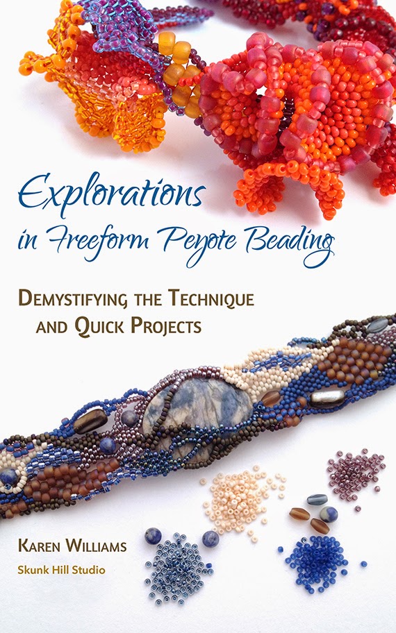
Volume 1: Demystifying the Technique and Quick Projects (Chapters 1&2)
I decided to combine the first two chapters into one ebook volume. This contains most of the diagrams detailing the core stitch techniques and ideas, a look at how the elements of design can help guide your beading and lots of great, smaller projects for getting started.
Includes:
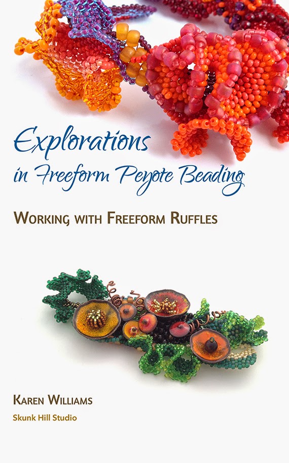
Volume 2: Working with Ruffles (Chapter 3)
Volume Two covers one of my favorite topics - freeform peyote ruffles! The chapter starts out with a series or ruffle experiments showing how slight changes in bead counts can create significant differences in appearance of the finished ruffles. From there, I dive into a series of projects using ruffles, including earrings, pendants, brooches and cuffs, finishing with a look at the softer freeform ruffles of my first featured artist, Jennifer Porter.
Includes:
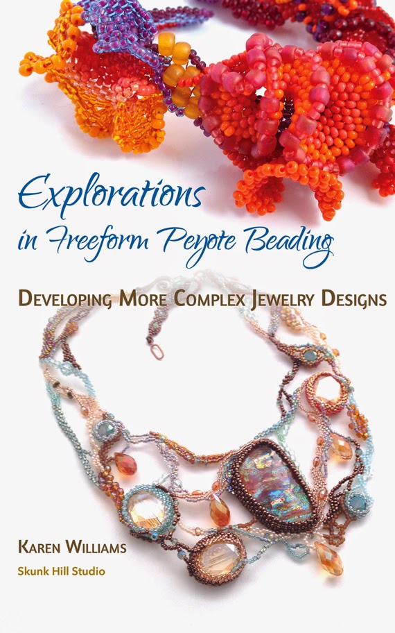
Volume 3: Developing More Complex Jewelry Designs (Chapter 4)
While I lightly touched on larger project such as bracelets and necklaces in the earlier chapters, here these designs become our primary focus. This chapter/volume is like a master class with an in-depth look at the design and creation process of myself and four extremely talented artists from around the world.
Includes:
Available on Amazon, or my Etsy Store.
Volume 4: Beaded Forms and Freeform Sculpture (
Chapter 5)
An introduction to the range of possibilities using freeform peyote as a sculptural medium. Trying to find a way to encapsulate and summarize this chapter, most simply it introduces two distinct modes of sculpture - covered shapes and hollow forms. Rather than trying to create a comprehensive look at all of the sculptural possibilities, I focused on areas of personal interest.
Includes:
Available on Amazon, or my Etsy Store.
The listings through my Etsy store includes an immediate download for the ePub (.epub) formats. If you'd also like the Kindle version, write "Kindle" in the Directions to Sellers section of your purchase and I will send a link to download the Kindle version within 48 hours. Unfortunately, the Kindle files are too large to upload to Etsy for direct download (file sizes again!), so this is the best work around I've been able to come up with for now.
Wow! What a year this has been. Explorations may have been my third book, but was definitely a learning experience every step of the way, building upon everything that came before. Having never published for Kindle or ePub, I had no idea what I was getting into. But I am truly pleased with the results.
File-size was the single largest factor in my decision to divide the book into four volumes for the digital edition. As a single file, the book was simply too large, with too many images, even once I'd reformatted the images for the screen. But my hope is that by dividing the book, it will also allow people to choose exactly the content that interests them most.
Once I divided the book into sections, I realized that I now had the luxury of space. With the single-column, flowing layout of ebooks, I didn't have to fit all of my information into one or two page spreads. So I went back to the drawing board and looked through the photos I hadn't been able to include in the print version due to file size, adding them back in where it seemed appropriate. Some of the ebooks have more additions than others, but each has at least a few new additions.
Here's a look at the set:
Volume 1: Demystifying the Technique and Quick Projects (Chapters 1&2)
I decided to combine the first two chapters into one ebook volume. This contains most of the diagrams detailing the core stitch techniques and ideas, a look at how the elements of design can help guide your beading and lots of great, smaller projects for getting started.
Includes:
- Basic Stitch Techniques: even and odd count peyote, increases, decreases and tubular peyote
- Freeform Peyote Variations: working along the length, working along the width, building bridges, working around curves
- Information on tools, materials and bead choices
- Elements of Design and how they relate to freeform beadweaving: Value, Line, Texture and Working with Color
- Photo galleries featuring additional works and ideas for expanding upon a theme
- In-depth photo essays detail the construction process for seven pieces
- Personal Planets beaded beads tutorial
- Ideas for combining freeform peyote with other media and beadweaving stitches
- Additional works by artists Ibolya Barkóczi, Sarah Meadows, Marlene Oman Emmons, Lisa Jones, Mary Kearney, Marsha Melone, Jennifer Porter, Ellen Lambright and Bobbie Rafferty
Volume 2: Working with Ruffles (Chapter 3)
Volume Two covers one of my favorite topics - freeform peyote ruffles! The chapter starts out with a series or ruffle experiments showing how slight changes in bead counts can create significant differences in appearance of the finished ruffles. From there, I dive into a series of projects using ruffles, including earrings, pendants, brooches and cuffs, finishing with a look at the softer freeform ruffles of my first featured artist, Jennifer Porter.
Includes:
- Three Ruffle Experiment photo essays show how stitch choices affect ruffle development
- Detailed photo essays share the design and construction process for five original pieces
- How the author developed the basic stitch techniques into series of related, but unique designs
- How to incorporate larger accent beads into freeform ruffle designs
- Developing a design around unique focal items, in this case enameled poppies and headpins
- How to incorporate the ruffles into larger projects with the Coral Dancer bracelet and Fallen Leaves cuff
- Works by featured artist, Jennifer Porter
Volume 3: Developing More Complex Jewelry Designs (Chapter 4)
While I lightly touched on larger project such as bracelets and necklaces in the earlier chapters, here these designs become our primary focus. This chapter/volume is like a master class with an in-depth look at the design and creation process of myself and four extremely talented artists from around the world.
Includes:
- In-depth photo essays detailing the construction process for five of Karen’s original designs.
- A closer look at the works of four featured artists from three continents: Natalia Malysheva, Cynthia Machata, Wendy Hatton and Janice Cuozzo
- Design tips for using paper mockups and simple sketches to test fit and design suitability before begin to stitch
- Troubleshooting suggestions to help salvage recalcitrant designs
- Additional works by Sherry Eagle, Liz Hart, Bobbie Rafferty, Mary Foyes, Mandi Ainsworth and Ibolya Barkóczi\
- Note - this chapter does not include beading diagrams or instructions on the basic stitches, and is best suited for beaders already comfortable with peyote stitch, including increases and decreases.
Available on Amazon, or my Etsy Store.
Volume 4: Beaded Forms and Freeform Sculpture (
Chapter 5)
An introduction to the range of possibilities using freeform peyote as a sculptural medium. Trying to find a way to encapsulate and summarize this chapter, most simply it introduces two distinct modes of sculpture - covered shapes and hollow forms. Rather than trying to create a comprehensive look at all of the sculptural possibilities, I focused on areas of personal interest.
Includes:
- In-depth photo essays detailing the construction process for two Beaded Bottles
- Tips and suggestions for working with armatures and beading around a form
- Ideas for creating smaller, sea-based sculptures including barnacles, anemones and nudibranches
- Featured artist, Nancy Dale’s detailed tutorial on creating Beaded Rocks expands the concept of encapsulating forms with freeform peyote
- A closer look at the freeform Beaded Fish of featured artist Georgia McMillan, with a detailed tutorial by Karen Williams
- Additional works by Cortney Phillips and Beth McGowan
- Note - this chapter does not include beading diagrams or instructions on the basic stitches, and is best suited for beaders already comfortable with peyote stitch, including increases and decreases.
Available on Amazon, or my Etsy Store.
The listings through my Etsy store includes an immediate download for the ePub (.epub) formats. If you'd also like the Kindle version, write "Kindle" in the Directions to Sellers section of your purchase and I will send a link to download the Kindle version within 48 hours. Unfortunately, the Kindle files are too large to upload to Etsy for direct download (file sizes again!), so this is the best work around I've been able to come up with for now.
Wow! What a year this has been. Explorations may have been my third book, but was definitely a learning experience every step of the way, building upon everything that came before. Having never published for Kindle or ePub, I had no idea what I was getting into. But I am truly pleased with the results.
Thursday, January 15, 2015
Book Tour and Blog Hop for Explorations in Freeform Peyote Beading
Welcome to day one of the Book Blog Tour for Explorations in Freeform Peyote Beading! This week five of the contributing artists and I are celebrating the book's publication with a virtual tour. There will be new posts each day and a chance to win door prizes!
Karen Williams, Baublicious
Friday, January 16
Cynthia Machata, Antiquity Travelers
Saturday, January 17
Nancy Dale, NED Beads
Sunday, January 18
Bobbie Rafferty, Beadsong Jewelry
Monday, January 19
Natalia Malysheva, Aqvatali
Sarah Meadows, Saturday Sequins
Leave a comment at each blog for up to a total of eight chances to win. Prizes listed below.
Blog Tour Names and Dates:
Thurs., January 15Karen Williams, Baublicious
Friday, January 16
Cynthia Machata, Antiquity Travelers
Saturday, January 17
Nancy Dale, NED Beads
Sunday, January 18
Bobbie Rafferty, Beadsong Jewelry
Monday, January 19
Natalia Malysheva, Aqvatali
Sarah Meadows, Saturday Sequins
Leave a comment at each blog for up to a total of eight chances to win. Prizes listed below.
Behind the Scenes - like the special features section on the DVD, here's a peak into a few random facts about the creative process behind Explorations.
Inception Date: One year ago today I launched the Kickstarter to support the book's production. After several months of debate and planning, I fully committed to the project on January 15, 2014. The Kickstarter was my way of introducing the idea to the world and saying 'Hey, what do you think?' After that, there was no easy way to back out - it was full steam ahead until the project's completion. That was one of the scariest days of my life.
By the numbers: All told, Exploration's 174 pages includes images of ninety three pieces by twenty two artists (including myself) from three continents and four countries. Detailed photo essays give a closer look at the construction and/or design process for twenty nine of the pieces, ranging from earrings and brooches to bracelets, necklaces, beaded bottles and even three-dimensional beaded fish.
Contributing artists: The sheer talent of the contributing artists is inspiring. Some I knew beforehand, many were new to me. I didn't know it at the time, but I fear I may have bullied Cynthia Machata into creating her first freeform peyote necklace for the book. I can't feel too badly about it because her Surf necklace is truly stunning. Mary Foyes and I went through several rounds of photographs of her First Holy Communion Veil before arriving at the final photos, taken by Shauna Ploeger. They are some of the finest in the book, and include the only photo in the entire book with a live model. I felt a bit like a stalker, contacting Ibolya Barkóczi to ask if I could use one of her bracelets to illustrate working along the width. Luckily she said yes and graciously sent several photos from which to choose!
Beta Testers: Borrowing from the software industry, I released six Beta versions to a subset of my Kickstarter community, sent once a month from June through November. The first Beta was embarrassingly low on content. Only 25 of the original 150 pages had anything on them besides the page headers. Of the twenty five pages with content, many boasted a single image as a promise of what was to come. I credit those Beta releases with keeping me honest and keeping me on track. Knowing that forty-two people were waiting to see what I'd accomplished each month was a great motivator to stay on schedule. Especially after my initial embarrassment.
Cover Image: At right is my earliest version for the book's cover. The only image carried over to the final cover is my Coral Dancer bracelet. In the proofing process, I ended up having the printers run two separate physical proofs. This is the cover for the first proof. The final cover was one of three I designed and was the overwhelming winner of a cover contest I ran with my Kickstarter community. The final cover back includes the works of my seven featured artists, which pleases me. But I still really like this cover, too.
Door Prizes
No party is complete without Door Prizes! I am super excited about this Blog Tour and put together prizes with lots of freeform beady goodness to celebrate.
updated 1/25/2015 - the prizes have grown since my original announcement, largely thanks to JJ Jacobs of Creative Soul Revival.
![]() |
| Sneak peak at Bead Soup mixes with JJ Jacobs' fused glass and Waterdrop beads |
Second Prize (2): a Freeform Bracelet kit (beads only) to make your own version of my Nautilus Flower Cuff OR Demeter’s Harvest Bracelet. I will draw one winner for each bead set. Each set will include all of the beads, including the closure, to make a bracelet similar to mine.
Third Prize (2): Small bead soup mix and postcard set. This set will include enough beads to make a smaller project like a Personal planets beaded bead, pendant or several rings. These prizes have grown, again thanks to JJ Jacobs! They now include bead soup mixes with three of JJ Jacob's Waterdrop 'sea glass' beads. You can see more of her beads here!
Contest Rules
Entries: One comment per person per blog post for a maximum of eight chances to win if you visit and comment on all eight blogs.
Please help spread the word on Facebook, Twitter and other social media! No extra entries for this, but lots of good karma for helping support and promote independent artists.
Make sure that there is an email associated with your comment! I will contact the winners by email by Thursday, January 22nd. If I cannot reach you by email, I reserve the right to choose another winner. I'll post the winners on my blog on Saturday, January 24th.
International visitors are welcome to enter. I'm willing to pay up to $10 worth of shipping for each prize - if shipping costs more than this, you would be responsible for the extra shipping. Once I have your postal address, I can give you specific shipping costs. As an alternate, you may choose to receive a digital copy of the book instead of your regular prize.
Thanks for checking out Explorations in Freeform Peyote Beading! Have fun hopping this week, and be sure to check in next Saturday to see who won the random drawing!
Subscribe to:
Posts (Atom)