Studio Musings

Wednesday, April 29, 2015

Lessons Learned: Family Photos vs Submission Photos

In my last post in this series, I talked about what I'd learned about submitting work from the "other side of the table", running a call for entry.  In that post, I spoke in general terms.  With her gracious permission, in this post I'm going to share the process Mary Foyes and I went through to include her piece. 

Mary's family photo of the veil she created for her daughter
It all started with a Facebook message asking if I'd be interested in including a freeform peyote first holy communion veil in my book.  Mary wasn't sure if I'd be interested because it wasn't 'jewelry', but sent a picture along, just in case.  That fact that it wasn't typical jewelry intrigued me, so I wrote back and asked if she had any other photos of the veil itself.

She promised to send some additional pictures that evening.


While these photos would likely be fine for personal use, there was no way I could use them in my book.  Mary's greatest concern was that I wouldn't be interested in her work because this was a 'beginner' piece.  That concerned me far less than the issues with the fuzzy carpet and the yellow color cast (not to mention file size, slight blurriness and image resolution issues). 

I liked that it was a wonderfully approachable example of 'thinking outside the box' in terms of what you can use bead weaving for.  Beyond that, it was one of only a couple of submissions I'd received that were stitched along the width (a less common technique than stitching along the length).  

At this point I knew that I wanted to include Mary's veil, but couldn't use the photos I'd received.

A side note here; I'm not a major publisher, with a streamlined submission process receiving hundreds of submissions.  Rather, I see myself as first and foremost an advocate for freeform peyote and for the other artists working in the field.  So I put on my thinking cap to come up with ways I could help her improve her photography. 


After a morning's research, I put together my next email.  I'm including the text here so you can see my process:

"I need high quality shots of your bead work on a completely neutral or complimentary background.  By complimentary, I mean something that seems to fit with the idea of First Holy Communion (think white, gold, soft lace, old prayer books, etc.) Alternately, you could take the shots on a live model, or even a larger doll if you wanted, but be careful of the backgrounds even then.  

I just did a little research on Etsy, and here's a shop that might give you some ideas:
Made4YouBoutique uses large dolls to showcase their headbands

Made4YouBoutique,  This listing shows a nice example of using a large doll as a model.
I really like the background in this listing.  The background is in such soft focus it becomes simply a color wash, but you'd need to make sure the beads are in crisp focus.  This is a depth of field issue, if your niece is a camera aficionado.
In this listing, I like the headband shown against the decorative paper backgrounds.  A trick I've learned when using decorative paper as a background - it the print seems too strong for a background, cover it with a layer or two of tissue to soften it.  Does that make sense?  I am not as fond of the wood backgrounds as they don't seem to say anything about the piece.


ButterCreamDolls spectacular photography makes me wish I had a little girl to buy for

Here's a shot from a different store (), on a real little girl.

I couldn't find the shop name when I went back while writing this post
And I like this shot from a third shop.  Also on a real girl, The focus is very much on the veil.  I could see your freeform band showing up beautifully in a shot like this.  And your daughter might enjoy having such a shot for her scrapbook, too.


I highly recommend using Etsy, Pinterest or other sites heavy on photography to get ideas for how to set up your photo shoots.  Look at background, lighting, how they display their items and which seem most appealing to you.


I'd like both some closeup (detail) shots, and a shot or two from a greater distance showing more of the veil and giving me room to crop the photo as necessary to fit my page layout.  Because the focus here is your freeform, the flower at the back of the veil isn't as important, but it's nice to see some portion of the veil itself to make it clear what it is."

Mary promised me new photos.   A couple of weeks later, these are what I received:

photography by Shauna Ploeger, Photography Du Jour

photography by Shauna Ploeger, Photography Du Jour
Mary decided to work with a professional photographer, Shauna Ploeger, of Photography Du Jour.  Shauna took a number of different shots, of which I've included three.  Gorgeous!  I loved that she included both horizontal and vertical versions of each shot.  This gave me tremendous flexibility when it came to page layout and design. 

If you choose to use a professional photography, make sure that they know how you plan to use the photos!  It is very important that you get the proper licensing if you plan to submit photographs for possible publication.  As a publisher, I need to be able to use the images in a variety of ways, and I need to not have to worry about photographers becoming understandably irate over unauthorized usage of their work. 

My artist agreement contract states that "Artist grants Author a non-exclusive, non-transferrable license to use the photographic representations of the Artist’s Work(s) provided by the Artist, in print and digital formats in relation to the publication of Explorations in Freeform Peyote Beading, referred to hereafter as the Book, including publicity and promotional materials including but not limited to websites, press releases, blog posts, posters, point of sale displays, postcards, etc. related to the book."  This is a fairly standard publishing clause.  When working with a professional photographer, make sure you have the license necessary to grant these permissions.  Get it in writing.  You may have to pay more for this license. 

Whether you plan to photograph your work yourself, or hire someone to do so, researching background and display options will give you a better understanding of what you'd like the final photographic product to look like.  Back when I worked as a gallery owner, an artist once commented that his slides were more important than his actual work, because the slides were what he'd be judged on for shows, grants and almost all other professional opportunities.   That shocked me at the time, but I'm coming to understand what he meant.  The photographic records of your work can be almost as important as the works themselves, depending upon what you hope to do. 

As solo artists, we wear so many hats!  Artist, photographer, personal publicity manager - each with its separate set of skills and proficiencies. 

Thursday, April 23, 2015

Went Fishing on Sunday, Guess what We Caught?

One of my earlier 2-Fish designs
Spent a wonderful day "fishing" at Fusion Beads this past Sunday.  The Catch of the Day were my two-faced fish pendants.  Because they're designed to lay flat when worn, only one side of the fish shows at a time.  This meant that each side could be slightly different.  They remind me of sunfish and never fail to make me smile.

My working title for the design was "One Fish, Two Fish."  Rather than fully encapsulating the core bead as in my other fish designs, these pendants allow the beauty of the central stone to shine through and become part of the design.

They're built with right angle weave, my second-most favorite (can you say that?) bead weaving stitch and what I think of as 'bead sketching' - drawing the fishy details with beads (size 15s). 


The other side of the same fish from above

Two of my students brought fish to show off from previous classes.  And they let me take pictures to share!

I love how Vala used orange thread with her cream beads for the body!

Is it just me, or does Vala's little fish look terribly sad in this picture?

Linda rocks my original Catch of the Day design, finishing it with a herringbone chain
I love their choices of colors!  Just wish I'd taken better photos.  I should have taken the pictures at the beginning of the day - my photography skills definitely decline by late afternoon.   These were the only three that even halfway came out of all the photos I took.

I also managed to snap a single pic of their works-in-progress from the class.  I waited too long and the other two students had managed to slip away before I thought to pull out my camera.  As it was, I had to snatch Linda's WIP out of her bag as she tried to pack.  I am so bad!

Vala & Linda's fish in progress.  (Linda actually started two separate fish)
I simply love teaching; it's such fun sharing my designs and seeing where others take them.  How they make them their own.  One of my students was new not only to right angle weave, but to bead weaving in general (she does come from a wire-working background).  It was interesting to see how quickly she became comfortable with the stitch.  Makes me wonder if the fact that she didn't know that right angle weave is often considered 'difficult' worked to her advantage.

Wednesday, April 15, 2015

Lessons Learned: Submitting Works to Calls for Entry

Continuing in my Lessons Learned series, this week I look at Calls for Entry from a curator's point of view.  Curator's need submissions:  without submissions, they have nothing to work with.  More they need focused, high-quality submissions.  As an artist, your goal is to get your work into the 'show'. 
The better your work fits with the curator's needs, the more likely it is to be accepted. 

Going into the planning stages for Explorations (2014), I wanted to include a wide range of designs by artists working in the field of freeform peyote beading.  Everyone brings their own style and interpretation to freeform bead weaving, and I wanted to highlight and share that diversity. 

I stated that I was looking for "original designs, high-quality photos and a wide range of styles.  The predominant beading style of all work submitted for consideration must be freeform peyote stitch, though pieces may include other beading styles, stitches and media.  Works may be jewelry, accessories or small sculptural pieces."  Here's the full text for the Call for Entry.  Launching the call, I didn't know what submissions I would receive, or how they would go together as a collection.    

General Suggestions for Submitting Works
Don't be afraid to submit!  The worst that will happen is that you'll receive a "thank you, but no thank you" letter.  I've received a number of these myself.  They aren't fun, but they are a sign that you are actively trying.  As an artist, when I receive such notices I remind myself that the rejection may have as much to do with how my work 'fit' with other submissions and the curator's developing vision as with the quality of my work and of my photography.   But there are things we can do to increase our chances of acceptance:
  • Check the fit!  Make sure your work fits the submission criteria.  Several of the submissions I received were lovely examples of freeform bead weaving, but not the freeform peyote stitch technique.  Since freeform peyote beading was the focus of my book, I couldn't include samples where the predominant stitch was anything else.  Perhaps I'll write another book with a broader focus.  This book wasn't it.
  • Use what ever submission mechanism they request.  Keeping track of all of the submissions can be a full-time job in and of itself.  I had multiple spreadsheets, and still had trouble keeping track of the status for many of the submissions, as I often needed to request different or additional photographs.  Make it easier on the publisher, gallery or curator by using their submission process. 
  • Submit your best work.  Yes, this seems like a no-brainer, but it needs to be said. 
  • Take the best photographs you can.  More on this below.
  • Make sure your photographs meet the Call's criteria.  Image size and resolution can make or break your submission.  I'll talk about this in depth later in this post.
Five Tips for Photographing your Work
Take the best pictures you possibly can!  This is especially important when submitting to major publishers.  Because I really wanted to include as many pieces as possible, I spent quite a bit of time working with several of the artists who submitted works to try to improve their photography enough to be able to use it.  More established curator's won't be able or willing to take this time.  Here were some of the most common problems:

Background: a neutral background is easiest for me to work with in book design.  In general, lighter colored backgrounds tend to be easier to work with than black or other darker colors.  The darker color backgrounds may be dramatic, but they can pose real challenges for page design.  Avoid colored backgrounds (deep blue, red, orange, etc.)!  With colored backgrounds, you increase the risk of conflicting with the curator's vision.  If possible, take a look at the backgrounds used in the photographs of accepted works from previous exhibitions or publications and try to use something similar. 

Background vs. Piece: Take some pictures where your work fills the background.  But also take some photos from a greater distance, leaving more background that can be cropped as necessary to fit the intended page layout.  Take photos from multiple angles.  Don't forget to take detail photos as well;  filling the photo frame with close-up views of your work. 

Look through your favorite magazines to see how they used backgrounds and staged pieces for photography to get ideas for how you might photograph your own work.  This is also useful if you plan to have someone photograph your work for you.

Clarity:  Make sure that the images are crisp and clear.  Blurry photos simply aren't useable, no matter how beautiful the work might be.  Also, make sure to check your photographs for fuzzies, bits of frayed thread, smudges and other little things that your eye overlooks when viewing the actual piece.  All of these little things tend to stand out like blazing beacons of ugliness in photographs.  If your photos have any of these, you really need to correct the problem and take new photos. 

Lighting: minimize color casts as much as possible!  Yellow or grey casts distort the other colors in your piece and make your work far less appealing.  It also means more potential work for the publisher: removing the color casts without messing up the rest of the colors can be quite tricky. 

Image size: Always, always take your photos at the highest possible resolution.  This will give you maximum flexibility as to how you can use them.

Here are two earlier blog posts I've written about photographing your work, including reviews for books on the subject:  Updating my Photography Setup and Photographing Beadwork Outside the Studio.  Both posts are older: this is a continual learning process for me, as I work to improve my own photography skills.  I still highly recommend The Crafter's Guide to Taking Great Photos by Heidi Adnum as an easy-to-read guide on the subject.

Preparing your Images for Submission
I can't tell you how disappointing it was to receive lovely images of incredibly beautiful pieces, only to realize that the images were too small, or of too low a resolution for me to actually use.  I know it was equally disappointing for the artists as well.  Worse, several of the artists had failed to save their original, larger images and had given away or sold the actual piece, so it was impossible to take additional photos.  Heart breaking!  Here are some ways to avoid this problem:
  Understanding Image sizes:
Photos are sized in two ways:  the total number of pixels (by height and width), and the DPI (Dots per Inch).  Make sure your images are large enough for the curator's use!
  • Height and Width:   What's truly important is your image's height and width measured in pixels.  As a general rule of thumb, your submitted image should be at least 1700-2000 pixels tall and wide.  Check the call for entry closely for specifics.
  • Height and width measurements in inches or centimeters are misleading.  These measurements are relative as they are based upon your image's current resolution (determined by dpi).
  • DPI, which stands for Dots Per Inch, is literally the number of pixels or dots that make up a single inch of the image.  At 72dpi, a single inch of the image is divided into 72 equal-sized squares.
Different publishing mediums require different images sizes.  Images are saved at different DPI depending upon whether they are designed for the screen or print:
  • Digital Publications:  Images viewed optimized to view on a screen or monitor are typically saved at 72 or 144dpi.
  • Print Publications: Images optimized for print publishing require a much higher resolution - a minimum of 300dpi.  
Here's an example of how this affects things:
  • I received a file that was 5"x7".  That sounds like it's plenty large enough for printing, right?  Unfortunately, it was saved at only 72dpi.
  • The image's total resolution in pixels was 360 x 504 pixels.  (5" x 72dpi = 360 and 7" x 72dpi = 504)
  • I then had to convert that to 300dpi (the minimum dpi for print publishing).
  • Converted, the image was only 1.2" x 1.68".  Too Small! (360/300=1.2" and 504/300=1.68")
Solutions:
Become comfortable with whatever image editing software you use so that you can change the image size as necessary to fit the submission requirements.   

Always, Always Preserve your Original Photos!!! You want to keep your original photos pristine, so that they are ready to edit for different purposes.  Do not save edits to your original file; use 'Save As' instead.
  • Open your original file
  • Make all necessary changes
  • Always use SAVE AS to preserve your changes.
  • Close the original file without savingDO NOT save the changes to your original file.  You want to keep original image without changes. 
This is especially important because some image file types use compression algorithms to reduce each image's file size.  Every time you save a .JPG, it tries to compress the file a little smaller, discarding what it thinks is extraneous data.  With several saves, these losses can become visible as jagged, pixelated edges.  And suddenly the file is no longer useable.


In closing, every Call for Entry is about building a collection.  Curators are looking to build a cohesive collection of the highest quality works and images.  As artists, our goal is to make it as easy as possible for the curator to fit our work into that collection.  Since our work will be evaluated based upon the photographs we submit, we want to do everything we can to make they act as the best possible ambassadors for our work. 

Friday, April 3, 2015

The Creative Journey with Bead Chat magazine

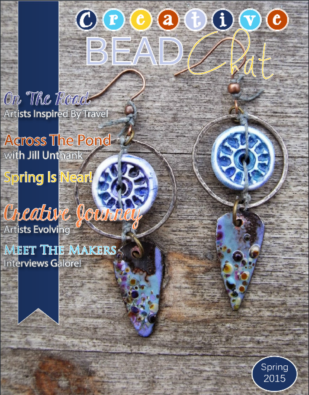
Cover - Spring 2015 issue, Bead Chat magazine
Creative Bead Chat, Spring 2015
Ready for a break, but don't have time to even think about a vacation?  Check out the Spring edition of Bead Chat!  The newest issue focuses on the creative journey, with 'travel reports' from the four corners of the world. 

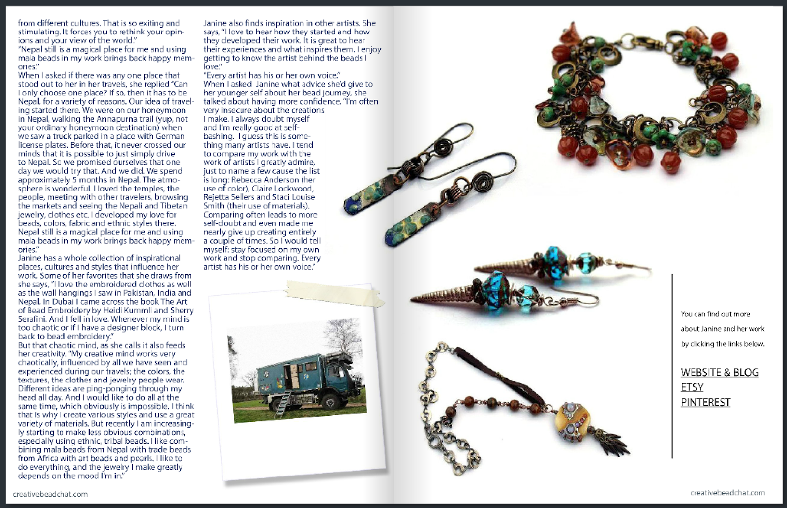
Cynthia Machata (of Antiquity Travelers) takes us to Malta to meet artist and designer Marica Zammit, and on the road with Janice Lucas, who has traveled to Nepal (and beyond) in her Mercedes Benz long-haul truck.  Even her 'truck' is cool - it looks like something out of a sci-fi movie to my American eyes. 

The brainchild of Melinda Orr, Creative Bead Chat works to connect kindred spirits - beaders, lampworkers, polymer clay artists, bead weavers, designers - there's something for everyone.  Bead Chat, their beautifully curated quarterly digital magazine, is written and produced by artists, for artists.

There's so much that I love about this magazine!  I can enjoy it simply as eye candy, flipping through the 'pages'.  It's a great resource for one-of-a-kind art beads by individual artists that you could incorporate into your own designs.   If I'm in the mood for more, the articles take me into the world of other designers; people I'd love to spend an afternoon with  around a beading table.  Best yet, when I see something I love or want to learn more about a particular artist, I can immediately click through to their website or blog.  The magic of digital magazines. 
 
Bead Chat article:  Journey to Malta to meet Marica Zammit, interview by Cynthia Machata
Journey to Malta to meet Marica Zammit, interview by Cynthia Machata

Bead Chat article:  Share Janice Lucas' journeys, written by Cynthia Machata
Share Janice Lucas' journeys (I love the insert photo of her long-haul truck!)

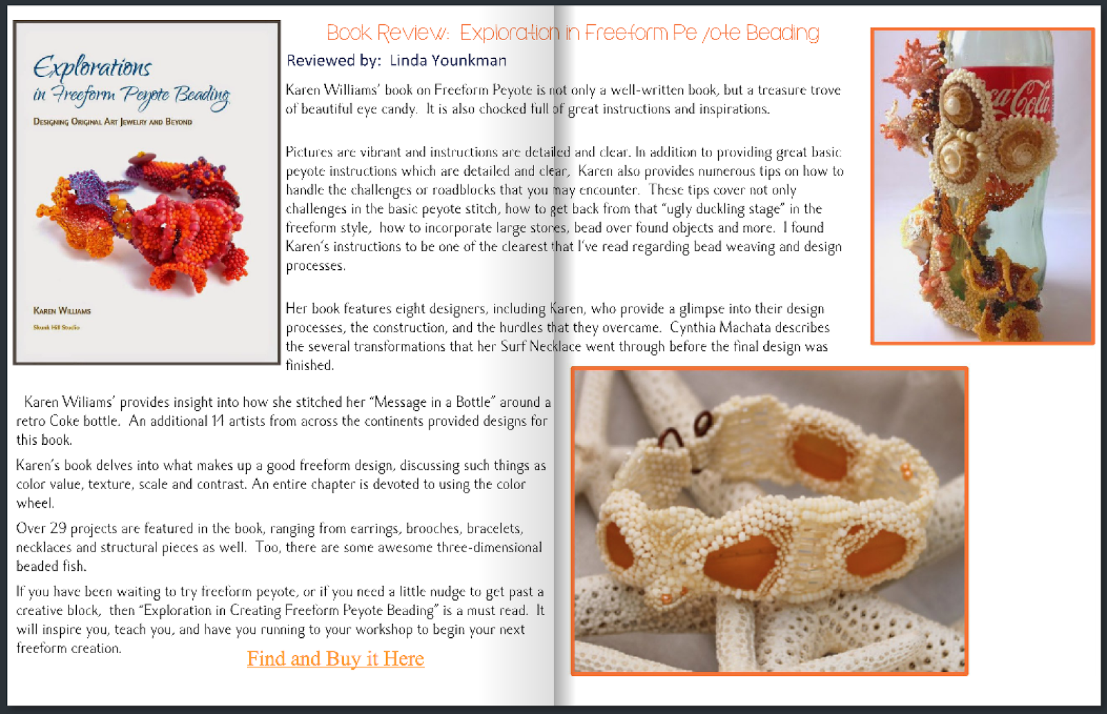
So you can guess how excited I was when they approached me to ask if I'd be willing to allow them to write a review for Explorations in Freeform Peyote Beading!  Uh, Yes!?  Please?  Linda Younkman wrote a lovely, two-page review.  I was even more thrilled with how well my book fit into the issue's overall theme of creative discovery. 

Bead Chat book review:  Explorations in Freeform Peyote Beading by Karen Williams, review by Linda Younkman
Linda Younkman's review of Explorations

It's always interesting to hear what my work looks like to others; what catches their eye and draw them in.  Only a portion of the first chapter is devoted to Color, but I am flattered that Linda found it comprehensive enough to view the section as an entire chapter.  The chapter (and book) opens with a review of the basic peyote stitch, followed by an in-depth look at the ways in which freeform peyote differs, then continues on to a review of the design principles (including Color) that can help give direction to our freeform bead weaving.  All told, the book includes over ninety pieces by twenty two artists, with in-depth photo essays exploring about a third of the designs.


I've touched on just a couple of the things which caught my eye in this particular issue of Bead Chat.  It would be easy to write another page or two.  Instead, I think I'll close this here and leave the rest for you to discover on your own.  After all, isn't that what creative journey's are all about?  I hope you enjoy Bead Chat as much as I have! 


Wednesday, April 1, 2015

Lessons Learned: Managing my Kickstarter Campaign

If you're just joining in, this is part of my new series focusing on the lessons I learned in last year's adventure in crowdfunding and self-publishing for my third book.  A Google search will turn up scores of posts with tips for creating a stellar Kickstarter campaign.  My goal here is to provide a much more personal look at the process based upon my own experiences.  In earlier posts, I covered designing a Kickstarter campaign and my experiences creating a Kickstarter video.  Now, I'll focus on what happened once the campaign was off and running.

The Kickoff
Make sure to tell everyone you know about your campaign!  I can't stress this enough.  The more people you have excited about your project, the better your chances of succeeding.  Don't bore people, but make sure to let them know - here's where an elevator pitch comes in.  Mine went something like "I'm running a Kickstarter campaign to support my newest book to help people learn to trust their creativity and make their own freeform beadwoven designs."

Even if they're not interested in your particular project, they may know someone who is.  My campaign succeeded entirely through the power of word of mouth.  I didn't know it at the time, but I really didn't have a large enough Facebook following for my campaign to succeed according to statistics (250 likes when the campaign launched).  But what I did have were friends who believed in my project and shared it with their friends, who shared it with their friends; and the rest was history. (Thank you all!!!!!)

Social Media and Spreading the Word:  
  • Play to your strengths.  I'm primarily a blog and Facebook kind of girl, so that's where I focused. If you're great at building Pinterest boards, using Instagram or Twitter - then use your medium to its fullest advantage.
  • Only a portion of your audience will ever see any one post.  With Facebook, the stats indicate that only 10-20% of my friends see any individual post.  
  • Use the power of personal emails.   I was slow to take advantage of this.  At the start of my campaign I emailed a few of my friends whom I thought might be interested.  I didn't want to send out "please give me money" emails, fearing I would sound greedy or money grubbing.  I have a sneaking suspicion this is something that women wrestle with more than men - one of those hidden paradigms in our culture.  Halfway through the campaign, a friend sat me down and told me that I was being foolish.  About that time, I realized that I didn't need to ask for financial funding; what I really needed to ask for was support in spreading the word. 
  • Respond to Everyone who Contacts You! I spent several hours each day responding to emails.  If you have more than one account, remember to check them all - you'll receive messages through Kickstarter, tweets, emails, Facebook messages and any other social media you use.  I'd never realized how many different ways there were for people to contact me.  It's exciting and wonderful, and can be tiring.  I was afraid that my emails would sound 'canned', so I tried to write an entirely new email to each person.  Some stock phrases are probably okay, especially if they are truly meant.
Keeping Things Rolling

Updates give you a chance to engage with the people who already support your campaign, and to woo those who might be considering jumping in.  They are automatically emailed to all of your Kickstarter supporters, and can be viewed from your main campaign page. 
  • Milestones - it's fun to post progress reports on your campaign, but I was advised to keep this to the major milestones. 
  • Insider Info - Updates are a great place to go into greater depth about aspects of your project that excite you.  For me one of these was full-bleed photography.  Since I'd published my second book, Createspace had finally introduced this printing option.  This meant that photos could stretch all the way to the edges of the page without margins, opening new, wonderful possibilities for page layout and design.  An update allowed me to show off how this could look. I also announced my Call for Entries for inclusion in the book in one of my updates.
  • Contests/Challenges and Rewards - I spent a lot of time looking through other campaigns to see what they used as extra incentives during their campaigns.  They key was to find something that would be of value to my supporters without destroying my budget.  Save your best ideas for the end, when there's already a greater sense of urgency.  
  • The most popular reward I offered (and the only challenge to succeed) was a full PDF copy of my original book, Freeform Peyote Beading.  The challenge was IF we received full funding by midnight on the last full day of the campaign, I'd email the download code for the PDF version of my first book to all supporters at the $40 level or above.  I have never sold the digital version of this book; the only way to receive a copy was through this campaign.  Which made it a more powerful incentive. 
  • Acknowledgements - with the tremendous support I received, I wasn't able to list everyone who helped spread the word, but I made sure to include shout-outs and links to everyone who wrote a blog post about my campaign. 
Navigating the Doldrums
Most campaigns do their best in the first and last week.  The first week everything is shiny and new.  The final week there's a sense of 'all or nothing' urgency.  The weeks in between were particularly difficult as I watched my campaign stall.    It helped to know that this was normal.  This doesn't mean you can slack off, nor does it mean you should give up.  I fretted, worrying about the all-or-nothing aspect of the Kickstarter process.  Should I have gone with Indiegogo, or one of the other sites that allowed for partial funding?  Should I have gone with a longer campaign (60 days instead of 30)?

See what I meant about mid-campaign doldrums?
Thank you, thank you to those of you who joined the campaign during weeks two and three; you helped keep my stomach from eating itself!

Going back to the statistics, I reminded myself that shorter campaigns had higher success rates.  I can see why; a longer campaign would have been more wearing, with a longer, potentially more devastating, trough in the in the middle.   The best advice I found for navigating my campaign's doldrums was to dig in, have faith, and keep going.  Spend this time continuing to build content to share, comb through your email and contact lists to see if there's anyone you missed, keep conversations going with your early supporters, and generally keep the faith.

It's good training for later in your project, when energy flags but you simply need to keep going.

Celebrate your Wins
Whether or not my campaign succeeded, I'd committed to celebrating my wins.  For me, that was the number of people who had turned out and turned up, who'd become involved and helped to push things forward.  For the first time in my publishing career, I had people actively excited and waiting for my new book to appear.  That in and of itself was spectacular.

If my campaign hadn't succeeded, it would have been hard.  I would have gone through a period of mourning.   However, I'd already committed mentally to pursuing this project either way.  The final project would have been paired down, and taken longer.  But there was enough excitement to indicate that the effort was warranted - my book could find its audience.

My campaign did succeed, and we were off and running, full-steam ahead with the actual project.  I spent the following week writing another flurry of emails and postcards - thanking everyone and sending out the first wave of rewards.  Since my rewards tiers were pretty complex, I also built a spreadsheet to track what each supporter was supposed to receive.  It was time to put processes in place for the long haul. 

In my next post, I'll talk about what I learned about submitting works and photographs to Calls for Entries from the other side of the table; running one.