Studio Musings

Thursday, August 30, 2012

Work in Progress Wednesday - New Kit & New Photos

Quinacridone Summer, freeform peyote beaded bead by artist Karen Williams
Quinacridone Summer, my newest freeform peyote kit
There's a one-woman celebration going on at my house!  Why?

Because I've finally finished putting together all the pieces and parts for my latest freeform peyote kit.  Available now on Etsy.  Woo Hoo!

This time it's a beaded bead, entitled Quinacridone Summer,  drawing its palette from the warm, rich colors of JJ Jacobs' abstract acrylic painting, Gypsy Wind.  

I finished the bead early this month, but just finished up the project notes on Tuesday.


As I began work on my Etsy listing, it occurred to me, wouldn't it be nice if I could show a sample of what the bead could look like made into a simple pendant?  Brakes on, full stop.  After a brief debate, I dusted off my rusty wireworking skills and made some head pins.

They had to be extra long to fit the bead and give me room to work.  With a pretty end at the bottom.  Something decorative.

One thing I've learned about myself is that the first or second of anything I make tends to be a bit rough.  This includes skills I haven't used in a while.  So I cut enough wire for two dozen headpins, pulled out my pliers, hammer and bit of railroad tie and went to work. 


Quinacridone Summer, freeform peyote beaded bead pendant and tutorial by artist Karen Williams
Together at last!  My full-color tutorial and my new beaded bead pendant

Head pins complete, it took me three tries to turn one into a reasonable looking pendant (you can see a closer shot in my Etsy listing).  And by then I was on a roll. 

 If it was a good idea to create a bale for this beaded bead, then wouldn't it be a great one to make bales for my Corset Bead kits, too?  I bet you can guess how I spent the rest of Tuesday and then Wednesday morning. 

That done, it was finally time to set up my little photography studio.  I think the photos turned out really great, so I have to share. 

Turquoise Antiquity, Corset & Stays beaded bead pendant by artist Karen Williams
New bale for my Turquoise Antiquity beaded bead


Corset & Stays beaded bead pendant by artist Karen Williams
I'll be making up kits for this one next week

Holiday Beads, Corset & Stays beaded bead pendant and ornament by artist Karen Williams
My favorite photo - festive Holiday beads

I am simply pleased as punch with how they all turned out!  A fun, silly fact, bottle in the last two photos was a bottle of milk that came with my slice of chocolate birthday cake.  :-)  

So, now my all my bead kits will come with decorative headpins and an little accent bead kit for bale making.  I'm not generally including my earwires (shown in the last photo - used as an ornament hook) with any of the kits.  But as a special for my blog readers, if you convo me with your purchase, I'll include earwires too.  Just let me know you want them. 

Monday, August 27, 2012

Vocabulary Review - The Elements of Design so Far

Right now I'm running a series covering the elements of design, introducing a new element every Monday.  Well, with the Bead Soup Reveal and Blog Hop this past weekend, I'm a little behind.   I thought I'd do a vocab review this week, then start in again fresh next Monday.  Figured it would work well for anyone just joining in to!

I also went hunting for additional links for each of the topics.

Value and Contrast

Value - the quality(ies) of lightness or darkness in a particular object or composition.

Contrast - how the different values in a composition work together.

Read the full post.

Additional Links: 
Inside Out Style takes a fun look at value and contrast using the coloring of a number of actresses for comparison.  The post also has a nice value scale photo in black & white and three colors. 

The design notes for Jim Saw's Art 104: Design and Composition class at Palomar College.  It's written as notes for a college class - heavy on information, but with fewer pictures.  Great if you want to really drill into the subject.  Also has a nice section on value and contrast as it relates to photography.


Hue and Intensity

Hue refers to the specific name of a particular shade of a color.  For instance Peacock blue versus Sky Blue.

Intensity allows us to look at the relative clarity of a particular Hue in reference to its base primary color.

Read the full post.


Additional Links:
The Color Cube has an in-depth look at color.  They use the terms "Chroma" and "Saturation" to look at what I term "Intensity".

Colors by Hue.  Microsoft put this list together for web designers, but it's a great reference for anyone studying color.   


Color Temperature and Undertones

Color Temperature - the inherent warmth or coolness of a particular color (especially in relation to its place on the color wheel).

Undertones - temperature variations within the same color family.  

Read the full post.


Additional Links:
There are no pictures, but Kate Smith at Sensational Color provides a a great explanation of undertones.

Again no pictures, but Exterior House Paint Colors goes into great detail about the relative effects of undertones on your overall composition.

Maria Killam has written an entire series on undertones.  Her focus is more interior design, but still useful.  And it has pictures!


So, there's my vocabulary recap.  Hope you have a chance to look at the original posts if you didn't catch them earlier.

And if you have links you think are particularly useful for any of these topics, please share - I'd love to put together a link library

And next Monday, we'll start looking at the color wheel. 

Saturday, August 25, 2012

The Briny Blue Bead Soup

Wrack and Ruin, freeform beaded necklace & earrings by Karen Williams
Wrack and Ruin, freeform beadwoven necklace & earrings
This year's Bead Soup took a number of twists and turns before I finally hit on the right track.  I thought I was going for polished at first.  

But the wonderful lines and striations in the stone Judy had sent called out for something more organic and freeform.  And who am I to resist that call?  I have no willpower where that's concerned.


So here's Wrack and Ruin, so named because I kept telling myself stories of buried pirate treasure as I worked.  

closeup of Wrack and Ruin, freeform beaded necklace & earrings by Karen Williams
closeup so you can really see the stone

The bead strands reminded me of kelp or seaweed, of tarnished bronze and deep sea water.  So even though I hadn't intended a sea piece, that's how it turned out.  I should just admit by now that all of my Bead Soup projects somehow relate back to the sea.  The briny soup from whence their inspiration came.

I don't normally use props in my photography, but the driftwood was just to perfect not to use it for a photo!

Oh, and Judy checked on the stone for me.  Turns out it's dyed Jasper.  I should have known - I seem to have a love affair with Jasper, even when I don't know it! 


Be sure to check out what Judy Riley of Three Red Beads made with the beads I sent her, and all the other fantastic Bead Soup creations.  And thanks again to Lori, our wonderful hostess, head chef and bead wrangler! 

Process photo - freeform beadwoven necklace  by Karen Williams
Just getting started - captured the cab, not much else
Hostess, Lori Anderson, Pretty Things

Agi Kiss, Moonsafari Beads 
Alice Peterson, Alice Dreaming
Alison Sachs, Beads by Earthtones
Amanda Dittloff, Passion Smashin'
Andra Marasteanu, Bijoux de Monanage
Angie Szlovak, SweetBeads
Anitra Gordy, Leelu Creations
Ann Sherwood, Ann's Blog
Arlene Dean, A Glass Bash
Audrey Belanger, Dreams of an Absolution
Barb Solem, Vivi Magoo Presents
Barbara Blaszczyk, laboratorim Flory
Bianca Odenthal, Zydies Glasperlen

Birgit Klughardt, GitesBeads
Bobbie Rafferty, Beadsong Jewelry
Bonnie Coursolle,  Jasper Gems
Cece Cormier, The Beading Yogini
Charlene Jacka, Clay Space
Cherrie Fick, En La Lumie're
Cheryl Foiles, Get Your Bead On
Christie Murrow, Charis Designs Jewelry


Process photo - freeform beadwoven necklace  by Karen Williams
Looked rather like a demented octopus at this stage!
Christina Miles, Wings n Scales
Christina Stofmeel, Feng Beads
Christine Stonefield, Sweet Girl Design
Cindy Cima Edwards, Live to Design
CJ Bauschka, 4 His Glory Creations
Claire Smith, Embergrass Jewelry
Cynthia Riggs, Cynth's Blog
Dana Fowler, Trunk Full of Treasure
Dawn Pierro, Turtle Moon Designs
Dee Elgie, Cherry Obsidia
Donetta Farrington, Simply Gorgeous

Dot Lewallwn, Speedie Beadie
Eileen Snyder, Dorset Hill Beads
Elizabeth Bunn, Elizabeth Beads
Eva Kovacs, Ewa gyongyos vilaga!
Evelyn Duberry, Sheba Makeda
Fay Wolfenden, Torch Fairy
Fen Li, Bead Flora Jewels
Gail Zwang, Angel Moose Enterprises
Geneva Collins, Torque Story
Grace Dorsey, Fan of the Flame
Gretchen Nation,  Art Food Lodging
 

Wrack and Ruin, freeform bead woven necklace by Karen Williams
Full view of Finished necklace
Hannah Annear, Squintessential
Hajer Waheed, My Beaded World
Heather Goldsmith, As I Bead It
Heather Otto, The Craft Hopper
Heidi Kingman, My Bead Therapy
Hope Smitherman, Crafty Hope
Isolina Perez, Isolina Perez
Jacqueline Keller, CreARTelier
Jane Haag, Did You Make Something Today?
Janeen Sorensen, Wild Vanilla Designs
Jean Peter, Jean P. Designs

Jennifer Judd, Jen Judd Rocks
Jennifer L Justman, Soul's Fire Designs
Joanna Matuszczyk, Bizuteria z filcu
Joanne Brown, Jo's Jewels
Joanne Lockwood, Jo Bunkum
Joyce Becker, Joyce's Joyful Gems
Judy Riley, Three Red Beads
Karen Mitchell, Over the Moon Design
Karen Williams, Baublicious - You're here!
Karin von Hoeren, Creative Ideen


wirework and bead earrings  by Karen Williams
Earrings with driftwood background
Karla Morgan, Texas Pepper Jams
Kashmira Patel, Sadafule .. always in bloom!
Kate Richbourg, We Can Make That at Home
Katrin Lembke, AllesPerle
Kathy Combs, Torched in Texas
Kathy Lindemer, Bay Moon Design
Kay Thomerson, Kayz Kreationz
Kelley Fogle, My Life, One Bead at at Time
Kelly Hosford Patterson, Traveling Side Show
Klaudette Koon, Only Road
Lara Lutrick, Lampwork Beads by Lara
Laura Guenther, Blue Antiquities

Laurie Lalonde, Simply Mod Jewelry
Lilik Kristiani, Soul of My Embodiment
Linda Younkman, Lindy's Designs
Lisa Chapman, Beach Cat Beads
Lisa Lodge, Pine Ridge Treasures
Loretta Carstensen, Designs by Loretta
Lori Bergmann, Lori Bergmann Design
Lori Dorrington, Lori's Adventures in Etsy Land
Lupe Meter, Gem's PC Corner
Lynn Davis, LLYYNN


wirework and bead earrings  by Karen Williams
Closeup earrings w/ my wirework (including ear wires)
Beaded bead pendant  by Karen Williams
Extra Credit: Beaded bead pendant
Malin de Koning, Beading by Malin
Mandi Effron, Craft-o-licious
Mandy Williamson, Mimi's Beading
Margot Potter, The Impatient Crafter
Maria Rosa Sharrow, Willow Street Shops
Marianne Baxter, Simply Seablime Jewelry
Marina Dobrynina, Savon Feutre
Marjolein Trewavas, Room for Change
Marelene Cupo, Amazing Designs
Marsha Neal, Marsha Neal Studio

Marta Kaczerowska, uhuhu
Mary Govaars, MLH Jewelry Designs
Melissa Trudinger, Bead Recipes
Menka Gupta, Menka's Jewelry Blog
Michelle Burnett, Reverie and Revival
Michelle Escano-Caballero, The Cabby Crafter
Miko Wiropati, Uniquely Yunikua
Milla Hope,  LB Creative Arts and Crafts
Mimi Gardner, Other Curiosities
Miranda Ackerley, MirandackArts
Natalie McKenna, grubbi

 
Noemi Baena, fuego, metal, y color
Pam Ferrari, Ferrari Originals
Pam Sears, Crazy Creative Corner
Penny Neville, Copper Penny
Rachel Baron, R. Baron Designs
Rachel Myers, Rockabead Jewelry
Rana Wilson, Definitive Designs by R. Wilson
Rebecca Anderson, Song Beads
Rebecca Sirevaag, Becca's Place
Riki Schumacher, Riki Jewelry


Rose Binoya, Ahtee's Blog
Rossana De Gaspari, Rdegas Blog
Sally Anderson, Wild Sally Road
Sandi James, Do Be Do Bead Do
Sandi Volpe, Sandi Volpe
Sandra Wollberg, City of Brass Stories
Sarah Goode, Pookledo

Sarah Small, blog by salla
Shai Williams, Shaiha's Ramblings
Shawn Mills, Shawn Marie Designs with Bent Wire
Sheila Davis, Stone Designs by Sheila


Beaded cabochon by Karen Williams
The cabochon's back
Sheryl Stephens, Babble Bead
Shiraz Biggie, Secret Song Designs
Solange Collin,  Ahowin Handcrafted Jewelry
Sonya Stille, Dreamin' of Beads
Stephanie Dixon, The Dixon Chick
Susan Kennedy, Sue Beads
Susan Sheehan, Strands of Thought
Suzann Sladcik Wilson, Beadphoria
Sweet Freedom, Sweet Freedom Designs
Tabatha Dinger, Modernly Created
Tania Hagen, Pelima Jewellery Design

Tanya Boden, Fusion Muse
Terri Gauthier, Blooming Ideas
Terry Carter, Tapping Flamingo
Tracy Stillman, Tracy Stillman Designs

Wednesday, August 22, 2012

Work in Progress Wednesday - Bead Soup Teaser

This Saturday's the final Bead Soup reveal of the summer.  I'm working with the wonderful collection of beads sent to me by my partner Judy Riley

Thought I'd do something a little different and show you where it is right at this very minute.  Currently, it reminds me of a tangled octopus.  What do you think? 

Good news is I have two more days to work on it!  Curious how it's going to turn out?  Check back on Saturday to see. 

Gotta go now - time for more stitching!

Monday, August 20, 2012

Hot, Hot, Hot or Not, Not, Not

Welcome back to my ongoing series on the elements of design.  Today, I'm continuing to look at color - focusing on Color Temperature and Undertones.

Color Temperatures working around the color wheel
Sunny yellows, red hot, cool blue - every color has an associated Color Temperature.

Working around the color wheel, those in the red to yellow range are warm.  While the blues, greens and purples are generally regarded as cool colors.  Seems simple enough, right?

Well, it gets a little more complicated than that, unfortunately.


The Color Temperatures on the Cusps Fluctuate.

That's right - red-violet and yellow-green are sometimes warm and sometimes cool.  Because they're stuck halfway between the warm and cool colors, they don't really know which family they belong to and shift their apparent color temperature dramatically based upon who they're paired up with.

Just to be ornery, they'll tend to take the opposite Color Temperature from the majority.  Kind of like reverse camouflage.

So, if they're paired with warm colors - lots of reds, oranges and yellows, they'll seem cool.  Snuggled in with cool blues, greens and violets, they suddenly turn up warm.  

Check out the lime green beads in my samples at right - they're the same in both photographs.


Then there are Undertones.  Here's where we get into cool and warm hues of the same color family.   

Looking at the swatches, which red would you describe as warm? cool?
Varying the undertones can create Temperature differences even within the same color family, such as the red sampler above.   Brick Red is quite warm, with strong orange undertones, while Alizarin Crimson is a cool red with strong blue undertones.

This is one way to increase interest in monochromatic compositions.  Undertones can also explain why different hues of the same color simply don't seem to go together. 

This week, take a look at some of your bead stash and try to identify the undertones of the various hues - do they tend to be warm, cool or evenly mixed? 

Saturday, August 18, 2012

Playing Hooky

Thanks to eveyone who sent me birthday wishes yesterday!  Joe and I played hooky for the day and had an absolutely great time playing tourists downtown. 


We even ran into a noon concert that made me feel like we'd stumbled upon the Central Park scene from the movie Enchanted!  The band, The Paperboys, is sort of a mix of Irish, big band, Mexican and folk music.   By the end of the concert, the space in front of the stage was full of people dancing (even me - if you can't dance in the street on your birthday, when can you?). 

Wednesday, August 15, 2012

Why Make This? Telling Your Story

Steph Cortes with her fantastic 'nerdy' crossstitch - Venn diagrams anyone?
Last week I attended a fantastic Etsy workshop with Steph Cortes of nerd JERK entitled "Balls Out Branding".  I'd dithered 'til the last moment, whether or not I'd sign up.  I am so glad I did.  It was a small workshop - just six of us, and Steph was a total riot.

I came away with two key points, presented in entirely new ways.  The first is the title of this post - "Why Make This?"  Steph pushed us to explore why, out of all the myriad things we could be doing, we are drawn to our particular art/craft forms.  And to tell the story of our work. 

Sounds so easy and in theory it can be so very hard.  Blogging's one thing - here it's really all about story.  But as soon as I head to my Etsy store to write listings, I start thinking about key words and how will people find me and what details about the product do they need to know.  All the dry, completely necessary, but often boring things.

It's easier in person, where you can sort of hash through ideas. I realized that conversation is in many ways like a first draft.  In most conversational instances, your words aren't expected to be picture perfect.  Instead, if you're like me, you sort of feel your way towards where you want to go.

So, Saturday morning found me sitting at the computer, looking at my Etsy listings and thinking about how I can add to them.  Except, great procrastinator that I am, I decided to go out hunting for other artists with story telling abilities and see how they did it.  A reconnaissance mission! 

I made a treasury to record my findings:

My very eclectic, story-telling treasury

As I searched and searched for stories, I became more and more open to what that could mean. 

With two of the items in my treasury, their photography tells the story. 

Emma Sommerfeld's cherry red scarf listing on Etsy
Emma Sommerfeld's collection of photographs for her Cherry Red Scarf is a study in simplicity and contrast.  Her model, a cross between Snow White and Little Red Riding Hood, wears a dark dress and stands in a winter forest.  All of the colors are shades of black, white or neutrals except for the scarf and the red lipstick. 

I absolutely cannot wear that color of red, yet she makes me want to buy this scarf because it's so beautiful and romantic.  Her shop's on vacation right now, but the links above should still work.


CamilleDesign's listing on Etsy for a cotton crocheted rug
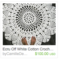
 On first glance, I thought that CamilleDesigns made crocheted doilies, reminding me of my grandmother Lela as she used doilies extensively in her decorating and I inherited many of them.  So of course I had to check it out. 

I discovered - she makes rugs!  Somehow I'd managed to miss the two bare feet at the bottom of the photo.   What a wonderfully clever way of showing the scale and immediately letting people know what they're looking at! 


Ramune's felted slipper listing on Etsy

Here, it was simply the title.  Where most of the listings from my search started with "Felted Slippers" or more detailed, "Felted Wool Slippers".  Here we have "like a sunrise on the ocean" - almost a little haiku.  Or the title of a painting.  I could wear a bit of vacation and art every single morning if I bought these!

Search engine optimization recommends including your search terms early, early in your listings.  But what if every once in a while I let poetry take precedence instead? 


Callie Mitchell's beaded bracelet tutorial on Etsy
With others, threads of story ran through multiple aspects of their Etsy presence.  
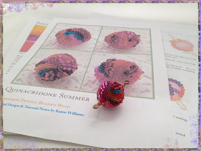
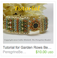
Callie Mitchell's beaded bracelet tutorial, Garden Rows, is beautiful in it's own right.  The story of her inspiration for the piece made it even richer (told in one short paragraph). 

Her artist bio continued her story as well; far more engaging than a dry recitation of dates and awards.


Don't want to bore you, so just two more call outs.

Steph Cortes' comic, A Girl Can Dream, Right?, listed on Etsy
Since she inspired this treasury, I wanted to include one of Steph's pieces and her comic, A Girl Can Dream, Right? was a perfect fit. 

I love how her listing starts with the story of the comic's origins, segues to the comic itself, then back to it's creation.  All in three short paragraphs.  Nice. 

I caught her at Geek Girl Con and made her sign a copy for me.  She even drew a little self-portrait!


Jimmy McBride's Crab Nebula listing on Etsy

And then the pièce de résistance.  If you only look at one listing, you have to check this one out simply because it's absolutely over the top.  Be sure to take a look at Jimmy McBride's artist profile - that's where it all comes together. 

His entire Etsy experience is internally consistent, even if it doesn't quite match the world as you and I know it. 


Steph Cortes wrote a special little page at the back of my comicSo, there were some of the examples I found.  Do you have any amazing examples of storytelling to share?  Ways of connecting the viewer to the artist or the art work?  I'd love to hear them!  :)

And like an extra scene after the credits at the movies, here's Steph's signature and self-portrait.  


Monday, August 13, 2012

Today's Vocubulary Words: Hue and Intensity

At different points in my life, I managed some fluency in both Spanish and Russian as well as maintaining some reasonable command of my native English.   Learning new languages always drives home two points for me:

1) Use it or loose it - if you stop practising a language, it becomes more and more difficult to use it with any fluency.

2) Our language frames and shapes our thoughts, and different languages make it easier to think about different things.

Which leads me to my theory - that if you have significant trouble working with color, it's likely because you've either never learned the particular vocabulary that would best allow you to analyze and interpret what you see, or that you simply haven't allowed yourself enough time to practice.  And that's really what this whole series is about; developing a working vocabulary.

Nine and a half different reds (acrylic paints)
Our vocabulary words for last week were Value and Contrast.  This week it's Hue and Intensity.

Hue refers to the specific name of a color.  For instance, the color red comes in many different hues.  A few common names include crimson, fire engine red, magenta, rose, brick red - I'm sure you can think of several more.  Each differs slightly from the other in one or more ways.


Intensity allows us to look at the relative clarity of a particular Hue in reference to its base primary color.  Primary colors are fully intense examples of their basic hues.  So, primary red is fully intense. 

In the print industry, Intensity is referred to as Saturation.

When we use adjectives such as bright, rich, dull or muted to describe a hue, what we are often trying to convey is its relative intensity (or lack thereoff). 


You can Alter the Intensity of a Hue without changing its Value in one of two ways:
1) Add in just a smidge of its complimentary color.   If you're working with red; add just a touch of green. 

2) Mix in a neutral grey of the same relative value.  Since the grey is the same value as your color, it will.

Working with paint (one of the easiest ways to play with color), I made some samples:


Playing with Intensity - Napthol Red & Cadmium Orange

Top row
* Left: painted a swatch of Napthol Crimson - relatively close to primary red.

* Middle: mixed my red with a drop of Sap Green, which is very close to the same value. This lowered the intensity slightly without changing the value much if at all.

* Right: mixed in a neutral grey (made from titanium white and ivory black).  Interestingly, my camera darkened the value of the least intense hue so that it is quite noticeably darker here in the photograph.

Less intense hues often appear darker than more intense jues to the naked eye - apparently my camera had the same issue.

Along the bottom row, I started with Cadmium Orange Light, mixed in a little Ultramarine Blue and then mixed in a neutral grey. 

To try and show the mixing in another way, take a look at this photocollage of my color mixing:


  •  Top left: color photo of my mixing pallet - the camera did a better job of recording the values here.
  •  Bottom left: the same photo converted to greyscale.
  •  Top right: checking values through a green film (the green discards all red-based color information)
  •  Bottom right: my Intensity worksheet converted to grey scale.
 So, my samples didn't turn out quite as well as I'd hoped, but we got to look at another vocabulary term:  Relative Value.  Which means that the apparent value of a Hue can be affected by its intensity. 

Red beads of varying intensities
Spanish dancer cuff: high intensity composition, detail Hunting Fae necklace: low intensity composition.  Both pieces by Karen Williams
Examples of high and low intensity compositions

And last, but not least, two samples again using some of my art work.  My cuff, Spanish Dancer, is bright and lively with a high intensity composition made almost entirely of pure, fully intense hues of each color.  Meanwhile, my Hunting Fae necklace has a more autumnal look with its range of much lower intensity hues.


Friday, August 10, 2012

Working on Freeform Peyote Kits

Ocean Currents, a Freeform Peyote Bracelet kit by Karen Williams
My first freeform peyote kit!
That's mostly what I've been doing this past week - working on kits for freeform peyote. 

I've put together three kits, only one of which is currently available in my Etsy Shop.  That's to make a bracelet similar to my Ocean Currents cuff


My Ocean Currents kits include ten different colors of seed beads shading from bright white to deep cobalt blue, 2 shades of drop beads, an assortment of accent beads, metal button, three different colors of beading thread, even two of my favorite beading needles.  The whole nine yards!

The idea is that it should have pretty much everything you need to dig in and get started.  So why haven't I listed the other two kits yet?  So far I've:

Hunted, sorted and rummaged through my stash of beads until I found the appropriate colors for each kit.

Measuring out seed beads into little plastic baggies
My postal scale comes in handy once again
Measured and weighed seed beads into little plastic baggies, feeling like quite the drug pusher.

Stitched up (and photographed the living daylights out of) a new freeform peyote Beaded Bead for my third kit.  This one's inspired by a friend; I'll tell you more about it next week.
 
Two of my kits with their respective inspiration bracelets
Packaged them up with pretty kit covers.  And tried to photograph everything. 

Then I thought, even if I do sell the kits with my book (which is one of the purchase options),  wouldn't it be nice to have some design notes pages for the project, similar to what I did for my Spanish Dancer bracelet in my book? 

So that's where I am now.  Working on design notes and trying to decide just how comprehensive they should be.  It's sort of like a hydra in that it seems to keep growing.  I check one item off my list and three more appear.  Today, I'll be working on those design notes again. I don't have much in the way of process photos for the two braclets, so I'm planning to create illustrations of key points instead. 

Between working on illustrations, editing photos, writing text, doing page layout and editing the whole shebang, I've decided to shoot for listing kits for my Peacock Spring bracelet kit and my new Freeform Peyote Beaded Bead next Friday.  Wish me luck!  I'm going to need it!  :)


Monday, August 6, 2012

Value and Contrast

color swatches arranged partially by value
Teasing apart the various elements of design so that we can look at each separately is difficult because they're all so closely intertwined.  Like a braided ficus, each is affected by the other.  This is particularly the case with value, color and contrast.  That said, I'm going to do my best to tease them apart and look at each separately.

So, what is value?  The best definition I've come up with is that value describes the quality(ies) of lightness or darkness in a particular object or composition.  When design folk talk about value, they use terms like "high" and "low" instead of light and dark.

High Value refers to very light values shading to white.

Low Value refers to very dark values shading to black.

Medium Values refer to (you guessed it) greys somewhere in the middle of the scale between light and dark.

To talk about how the different values in a composition work together we use the term Contrast.

If a piece is made up of a number of widely differing values it has High Contrast.  So, a piece made up of black and white, like a chessboard, has high contrast.  The greater the value differences, the greater the contrast, the more the individual values will stand out in a black & white photo.

If the values in a piece are all relatively close, then a piece is considered to have Low Contrast.  In Low Contrast compositions all of the values cluster in one section of the value scale - high, medium or low.  Pastels are a great example of a high value, low contrast composition.

Discarding color information makes it easier to look at value compositions.  Take a look at the two photo collages below and you'll see what I mean.

Four Bead Woven pieces by Karen Williams
from top left: Winter Flame, Ocean Currents, Sea Life, Spanish Dancer

black & white photo collage of four bead woven pieces by Karen Williams

All of my compositions tend to hover in the mid-values, which is fairly common amongst modern bead and fiber artists oddly enough.  My Ocean Currents bracelet stretches the farthest into the high and low values, ranging from a deep cobalt blue to bright white.  My Sea Life pendant's not far behind.  But interestingly enough, my Winter Flame pendant shows far less value contrast along the outer edges than I might have expected.  I'll talk about the reason for that in next week's post. 

Why do we care about value?

1) Value contrast can help us to differentiate between the various elements in a composition.

2) Value can help direct your eye through a composition, as our eyes are drawn to lighter, brighter objects first. 

3) Value carries an emotional impact.   Take a look at the three abstract paintings below (from an original encaustic wax painting by Carol Trammel) - what is your initial, emotional response to each piece?  I've used an abstract to help remove contextual input.

High Value Sample:  from an original encaustic wax painting by Carol Trammel
high value, low contrast


Mid Value Sample:  from an original encaustic wax painting by Carol Trammel
mid value, mid constrast


Low Value Sample:  from an original encaustic wax painting by Carol Trammel
low value, low contrast

All three are the same composition, but I adjusted their value levels.  What adjectives would you use to describe your reaction to each?

Now it's time to take a look at your own compositions.  Does your work tend to cluster around one segment of the value scale?  Which end?  Does your work tend to have high or low contrast?

Sunday, August 5, 2012

Book Review & Design Thoughts

Kristen reviewed my book, Freeform Peyote Beading this past week for the popular blog Art Jewelry Elements.  I've followed Kristen's personal blog, My Bead Journey, for some time and have gotten to know her online.  While she's a seed beader extraordinaire, she started out firmly in the "no way" camp towards trying freeform herself.  I think I may slowly be tempting her to the wild side, but in the meantime, her review provides a very different look at my book, focusing largely on my discussion of color and design.


Which has had me thinking more about design.

Sketches - translating coral to a design
In my book, I look at a number of the elements of design that I use most often in my work, then briefly touch on the principles of design.  Early on, those two really confused me - what's the difference between elements and principles?  I finally figured it out like this:

Elements of Design are like tools or building blocks you use in constructing your design.  The design element's I use most include:
  • Value
  • Color
  • Line
  • Texture

Principles of Design are more like a set of architectural blueprints or plans.  They help you figure out how exactly everything goes together and include:
  • Unity
  • Rhythm
  • Balance
  • Proportion
  • Opposition
  • Variety
And since I'm thinking about them, I thought I'd launch a weekly series; every Monday for the next several weeks, I'll focus on one of these in turn and whatever I'm doing with them at the time.