1) Use it or loose it - if you stop practising a language, it becomes more and more difficult to use it with any fluency.
2) Our language frames and shapes our thoughts, and different languages make it easier to think about different things.
Which leads me to my theory - that if you have significant trouble working with color, it's likely because you've either never learned the particular vocabulary that would best allow you to analyze and interpret what you see, or that you simply haven't allowed yourself enough time to practice. And that's really what this whole series is about; developing a working vocabulary.
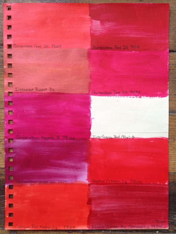 |
| Nine and a half different reds (acrylic paints) |
Hue refers to the specific name of a color. For instance, the color red comes in many different hues. A few common names include crimson, fire engine red, magenta, rose, brick red - I'm sure you can think of several more. Each differs slightly from the other in one or more ways.
Intensity allows us to look at the relative clarity of a particular Hue in reference to its base primary color. Primary colors are fully intense examples of their basic hues. So, primary red is fully intense.
In the print industry, Intensity is referred to as Saturation.
When we use adjectives such as bright, rich, dull or muted to describe a hue, what we are often trying to convey is its relative intensity (or lack thereoff).
You can Alter the Intensity of a Hue without changing its Value in one of two ways:
1) Add in just a smidge of its complimentary color. If you're working with red; add just a touch of green.
2) Mix in a neutral grey of the same relative value. Since the grey is the same value as your color, it will.
Working with paint (one of the easiest ways to play with color), I made some samples:
 |
| Playing with Intensity - Napthol Red & Cadmium Orange |
Top row
* Left: painted a swatch of Napthol Crimson - relatively close to primary red.
* Middle: mixed my red with a drop of Sap Green, which is very close to the same value. This lowered the intensity slightly without changing the value much if at all.
* Right: mixed in a neutral grey (made from titanium white and ivory black). Interestingly, my camera darkened the value of the least intense hue so that it is quite noticeably darker here in the photograph.
Less intense hues often appear darker than more intense jues to the naked eye - apparently my camera had the same issue.
Along the bottom row, I started with Cadmium Orange Light, mixed in a little Ultramarine Blue and then mixed in a neutral grey.
To try and show the mixing in another way, take a look at this photocollage of my color mixing:

- Top left: color photo of my mixing pallet - the camera did a better job of recording the values here.
- Bottom left: the same photo converted to greyscale.
- Top right: checking values through a green film (the green discards all red-based color information)
- Bottom right: my Intensity worksheet converted to grey scale.
 |
| Red beads of varying intensities |
 |
| Examples of high and low intensity compositions |
And last, but not least, two samples again using some of my art work. My cuff, Spanish Dancer, is bright and lively with a high intensity composition made almost entirely of pure, fully intense hues of each color. Meanwhile, my Hunting Fae necklace has a more autumnal look with its range of much lower intensity hues.
No comments:
Post a Comment