Studio Musings

Thursday, September 10, 2015

Signs of Fall - Beaded Acorns

my 'acorns' look right at home with their forest counterparts
The weather here in Seattle is cooling fast; the dog days of summer are gone and we're quickly heading into fall with a week's worth of rain.  The leaves haven't started turning yet, but acorns are falling everywhere I look.

Walking home last week with a pocket full of acorns, I decided to pull out my beaded acorn earrings tutorial.  Never fully satisfied, I reworked things, adding several new diagrams and brand new photos.  The tutorial's now up on my Etsy store.


I lied - one single branch on the tree outside my front door has turned!

Happy Autumn! 

Thursday, August 27, 2015

Summer Snowflakes

my Snowflake tutorial - still available on Etsy
Back in 2011, I opened my Etsy store with exactly one item - my beaded Snowflakes and Stars PDF tutorial.  For some reason that I cannot now remember, I didn't list my first book on Freeform Peyote Beading until months later.   Needless to say, I have a soft spot for these little beauties.  They're rather the potato chips of my beading world.  I can never seem to make just one, and they're a quick and satisfying 'beading snack'.  When I don't know where I want to go with other projects, I find myself making snowflakes.

Most recently, I've been playing with Summer Mandalas, and sequins.  What happens to snowflakes when you use other colors?  Here are a couple of my discoveries.


First, I decided to work with Hot, summery colors in reds and oranges, with a pop of cool lime:

Summer beaded Snowflake Mandalas in red, orange, pink and lime green with sequins.  Pendant and necklace set by artist Karen Williams

This pendant and earring set makes me think of margaritas and summer flowers.  Not a hint of snow in the forecast!  After a little experimentation, I found I particularly liked the look of matte transparent and opaque beads best.  They created the most striking lines and the best foils for the sequin embellishments.

But what if I wanted a necklace to cool off in the summer heat?  To answer that question, I started playing with turquoisy blues and bright greens, with lime sneaking into the color palettes every time I looked away.

Summer beaded Snowflake Mandalas in turquoise, teal, black and lime green.  Pendant with sea glass ring by artist Karen Williams


The colors reminded me of a dress I purchased last summer.  Thinking it would be fun to make a necklace to match, I began playing with more stars.  The dress, by Desigual, has an asymmetric design across the front, which I hope to echo in my design as well.  Right now, all I have are component parts, which I thought I'd lost for most of the past month.  Luckily, they turned up this morning while looking for something else.  Yeah!  (Especially since I couldn't even find the pictures I'd taken before!)
  
Not completely sure where I'm going yet!
With the largest component, I'm going for a field of stars effect.  Not quite sure if I like the crystal interstitials or not.   They're supposed to take the place of the white polka-dots from the dress's design.  Adding white to the necklace seemed like simply too much.

 It's such fun swapping out the colors to see where things end up.  I first did this a few years back with my Halloween Snowflakes, complete with little lampworked bats to finish off the earrings.  Doing some inventory, I found I have exactly of those two kits still available, and have relisted them on Etsy. 

So there are my summer experiments!  How about you? Any crazy color experiments this season?


Wednesday, August 19, 2015

Registration is now open for Fall Classes at Fusion Beads

Registration for Fall Classes at Fusion Beads opens today!  They offer an incredible selection of classes in bead weaving, pearl knotting, wire working, chainmaille and metal working, resin, fusing, PMC and more.  Their Fall catalog features seventeen pages of workshop goodness, with over eighty scheduled workshops.

I’ll admit, I’m tempted to take one of Sarah Thompson’s wire weaving classes.  Her Embrace Ring is featured at the bottom right of the  cover page.  It’s a technique that I’ve been curious about, and a class is a quick and easy way to give it a try. 

This fall, I’ll be teaching four classes between from October to just before Christmas.  Kicking off the semester with my Freeform Peyote Rings.


Freeform Peyote Rings
Sunday, October 11, 2015 from 2:00 - 5:00pm
If you’ve never tried freeform peyote stitch, this is a great place to start!   

Freeform Peyote Ruffles
Saturday, November 7 from 11:00 - 5:00pm
Ready to move on to more advanced bead weaving techniques? 

Lantern Ornament Beaded Beads
Sunday, November 15 from 2:00-5:00pm
With the holidays coming up, these elegant beaded beads make great ornaments, gift toppers, or hostess gifts.  They can also be worn as unique pendants or incorporated into other jewelry designs.

Snowflakes and Stars
Sunday, December 20th, 2:00-5:00pm
Need a beading break from the holiday madness? Come join me for an afternoon of laid back holiday cheer as we make a variety of beaded snowflakes and stars. 

Thursday, August 13, 2015

Meet Spike and Pete, Creative Block Busters Extraordinare!

Spike, happily swimming through a 'rock stream' in my garden
You might have already caught a peak of Spike in my earlier post for the Time to Stitch challenge about bead embroidery.  Both he and his younger brother Peter (Pete for short) made their official debut in the Summer issue of Creative Spark magazine produced by Znetshows.com.


 Besides being incredibly fun to stitch, these Happy Fish turned out to be the antidote to a months-long episode of creative block.  After finishing Explorations in Freeform Peyote Beading, I'd promised myself time for personal exploration, where I could play with any design or beading ideas my heart desired.  This included signing up for Robin Atkin's Bead Journal project at the end of last year. 

Fast forward to April, and I still hadn't beaded anything significant, nor made a single bead journal entry.  Aack!  Yes, it had taken significantly longer than anticipated to finish the rewrite/reformatting for the digital versions of Explorations, but that still left several months of creative wasteland.  Looking back, part of the problem was while I said I wanted to 'play', I felt like I should work on a series of large, extremely challenging sculptural pieces.  My creativity simply doesn't work that way.  Not for me. 

Spike, sans sea glass.  Poor Spike!  He's underdressed.

For me, if I promise my creative self play time, then I assign it work, I have a rebellion on my hands.  All of my best work seems to come from little seeds, from saying 'let's just' or 'what if' and from not being too invested in the initial outcome.  Sometimes I forget this personal truth!

Then something like my Happy Fish comes along to remind me.  By the time I settled in to make a piece for Christine and Therese's challenge, I didn't have enough time to make a 'fancy project'.  Combine that with my love for Georgia McMillan's Happy People, and a desire to use sequins a la Sarah of Saturday Sequins, and Gilbert, by first Happy Fish was born. 

Pete shows off his 'plumage'.  Fused glass cabochon by JJ Jacobs
 He was so much fun, I immediately started in on a second fish - this time I wanted to use these really cool stone spike beads I'd picked up last year, but hadn't found a use for yet.  When Hope invited me to participate in the Summer,  sea glass issue for Creative Spark, saying Yes! was a no brainer.  My fish NEEDED sea glass for their tails.  They told me so, really, in no uncertain terms.  They explained that no self-respecting fish would let itself appear in public without their lovely sea glass tails!  (Sorry Gilly) 

And while all this silliness played through my head, I was off and beading again.  Meanwhile, as I worked on the fish, ideas for other projects began appearing, almost as if someone had finally managed to turn the handle of a long-rusted tap.   I've even started work on the first in my new sculptural series. 

Let's hear it for the power of play! 

I'm about ready to start on a new Hapy Fish.  This one is going to have flowers.  Normally, my garden is in full bloom this time of year, but because it's been so hot here in Seattle this summer everything bloomed early, and my poor garden is looking a bit bedraggled. No flowers in my garden?  Well then I'll decorate my fish with flowers!  Even fish would like flowers, right? So why not? 


Wednesday, August 5, 2015

Creative Spark Seaglass Spectacular

Summer 2015 Creative Spark ezine edited by Hope Smitherman, produced by ZnetShows.com
Summer 2015 Creative Spark ezine
I love sea glass!  When I go to the shore, it's a real challenge for me to walk along the beach at a normal pace, because sooner or later I get caught up in the search for the elusive sea glass.  Especially the rarer colors, such as the deep cobalt/sapphire blue that's my favorite find.  I can get so caught up in the search, I'd miss the sailboat regatta tacking around the bouys fifty feet out from shore.  Or the kite surfer dancing across the waves, or my husband waiting patiently for me a mile up the beach.  Oops!

Then, I discovered ZnetShows' cultured sea glass beads.  I can't truthfully state that I've completely abandoned my search for seaglass in the tide line, but I CAN say that I am much more easily distracted from the search.

ZnetShow.com's cultured sea glass is so lovely - it comes in all sorts of wonderful shapes, though I'm particularly fond of the more organic 'shard' designs that echo the shapes of 'natural' sea glass.   So you can imagine how excited I was to be invited to participate in summer, sea glass edition of Creative Spark.

Sea glass shards from ZnetsShows' website. They say 'fish fins' to me!
Hope Smitherman, Creative Spark's fearless editor, asked us to work with a sea-inspired or 'summer' theme.  While the main focus is on jewelry design, she also asked for upcycling/recycling and non-jewelry designs.

Sea-themed and non-jewelry?  Yep, you know where I went.  I quickly finished up Spike, my second Happy Fish.  He now sports sea glass tail fins.  And he's joined by his younger bother Pete, who sports deep blue tail fins.  I finished both up back in June, and have been waiting to say anything ever since.  You can see them both in the pages of Creative Spark, along with a sneak peek at work on my newest freeform peyote fish.  It's still in very much in progress.

My contribution may just be the quirkiest, but looking through the other artists incredible designs is simply inspiring.  Flipping through the pages, I find my fingers itching to go digging through my stash to play with more sea glass! 

Take a look and see what I mean:  Creative Spark, Summer 2015.

Thank you Hope, for once again putting together such a gorgeous magazine! 

Monday, July 20, 2015

Milestone Giveaway: 1000 Facebook Fans!

Feel like I should add some stars and balloons to the photo!
Last week I hit one of those personal milestones: 1000 Facebook fans for Skunk Hill Studio.  The past year and a half has been an incredible journey.  Producing my newest book, I have connected with so many fascinating, creative, artistic people throughout the world.   Thank you for sharing this journey with me!

Celebrating the milestone, I'm hosting a little giveaway.  Leave a comment on my Facebook page, and you'll be entered to win one of my ebooks or tutorials.  Freeform peyote, fancy fish, elegant beaded beads; if it's digital, the choice is yours.

I'll be drawing a winner on Wednesday (July 22nd), so you have until I sit down at my computer Wednesday morning to enter.  Don't you love my precision deadline? 

Thank you!

Wednesday, July 8, 2015

Lessons Learned: Setting up a Book Project in InDesign

I plan to get technical in this Lessons Learned post.  If you're thinking about producing your own self-published book, then I hope this will be useful to you.  Otherwise, I'm hoping that it might give you a behind-the-scenes look at the less glamorous side of the process. 

I use InDesign by Adobe for the layout of all my book projects, including my shorter PDF tutorials.  While there are other tools available, I  appreciate InDesign's power and versatility.  The only limit to what you can produce are one's own capabilities.  The good news is, I've found that you can start with a few basic tools, and learn from there as needed to achieve your desired results.  I read and watched more than a few internet tutorials over the course of this project!

Creating a New InDesign Document

The New Document Dialog Box:
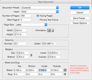
New Document dialog box

This is the same set-up I used for Explorations. There are three choices under "Intent": Print, Web, or Digital Publishing.  I always choose Print as my default because it requires the highest resolution.  It's easier to reduce resolution later for other publication channels than to increase it. 

I started with 150 pages, which was my initial page-count goal.  it's easy enough to add pages later.  I've heard it suggested that you break your document into smaller files so that it doesn't 'bog down' as you work.  I kept mine as one document, but this likely depends upon your individual setup.

Note that the inside margin is larger than the top, bottom or outside.  This is to prevent the book's contents from disappearing into the ditch of the binding.  Because I planned to have some of my images bleed off the edges of the page, I added a bleed margin.  Making sure that each image extends at least .125 inches off the edge leaves room for trimming errors at the printers.

When I click okay, my new, blank document appears:
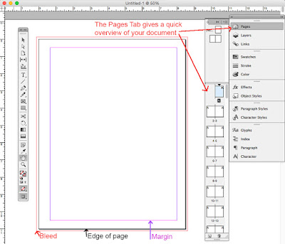
The blank document, with a toolbar to the left and control panels to the right

I've opened the Pages control panel at top right to show a quick overview of my document's pages.  At the bottom of the image, I've noted the bleed, page and margin guidelines.

Setting up Page Masters

Next, I recommend setting up Page Masters.  You can use Masters to create uniform layout grids and add page numbers or any other information that you wish to repeat over multiple pages.  For Explorations, I created separate masters for Chapter Heads, as well as One, Two and Three-Column layouts.  I also used the masters to display the page numbers.
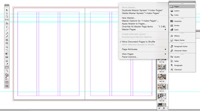
Setting up a 3-column master, and the Pages dialog box
If you look closely at this screenshot of a two-page/three-column Master from the final file for Explorations, you'll see thumbnails of the populated pages from the book.  As you add information to each page, it will show up in the thumbnails.
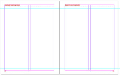
A master from my first book. Each chapter title appeared on its pages.
With my first book, I also used masters to list the chapters' titles on each page within the chapter.  The chapter titles are outlined in orange in the screenshot because I don't have the font I originally used on this computer.  One of those unfortunate quirks from having to purchase a new computer when the old one dies - always a few things that didn't transfer over.  But InDesign tells me which font I used, so I can purchase a new license, should I so choose.

Building Font and Paragraph Styles

Now that I have my Page Masters set up, it's time to set up my Font and Paragraph Styles.   I touched on this in my last Lessons Learned post. Before I began active work on the page layouts, I put together a cheat sheet of all of the font styles and colors I planned to use.  To make it easier to reference, I stored the info as a separate Master in my InDesign file.
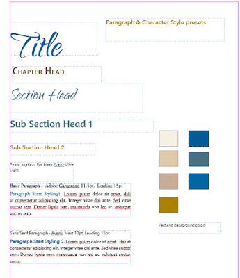
A reference 'cheat' sheet for the book's font styles and colors

Then it's time to actually set up the Paragraph Styles by specifying the font, size, leading, color and more for each of your text blocks.
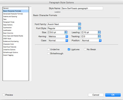
The left-hand menu allows you to fully customize each Paragraph Style
I set up separate styles for each level of text:  Titles, Chapter Heads, Section Heads, Body Text, etc.
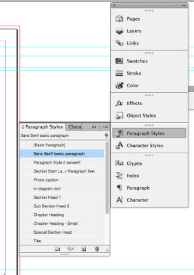

The Paragraph Styles Control Panel with my presets

Once you set up each of your Paragraph Styles, the control panel let's you easily format blocks of text. Simply select the text you want, then click on the style you want.  Your text is instantly styled with your presets.  It takes time to set up all of the paragraph styles - I spent the better part of two days tweaking things to make sure I had what I needed.  But speaking from experience, they can literally save you days and weeks worth of time once you start working on the page layout! 

Ready to Rock

Whew!  At long last, after nine Lessons Learned posts, we are finally at a point where I can start talking about page layout in the next post.  I'll share my iterative process and how I work to put all the pieces together into a cohesive whole, at least when all goes right!  Thanks for joining me on the recap of this journey.

Have any questions about masters or paragraph styles?  Let me know!