Studio Musings

Showing posts with label photography. Show all posts

Wednesday, April 29, 2015

Lessons Learned: Family Photos vs Submission Photos

In my last post in this series, I talked about what I'd learned about submitting work from the "other side of the table", running a call for entry.  In that post, I spoke in general terms.  With her gracious permission, in this post I'm going to share the process Mary Foyes and I went through to include her piece. 

Mary's family photo of the veil she created for her daughter
It all started with a Facebook message asking if I'd be interested in including a freeform peyote first holy communion veil in my book.  Mary wasn't sure if I'd be interested because it wasn't 'jewelry', but sent a picture along, just in case.  That fact that it wasn't typical jewelry intrigued me, so I wrote back and asked if she had any other photos of the veil itself.

She promised to send some additional pictures that evening.


While these photos would likely be fine for personal use, there was no way I could use them in my book.  Mary's greatest concern was that I wouldn't be interested in her work because this was a 'beginner' piece.  That concerned me far less than the issues with the fuzzy carpet and the yellow color cast (not to mention file size, slight blurriness and image resolution issues). 

I liked that it was a wonderfully approachable example of 'thinking outside the box' in terms of what you can use bead weaving for.  Beyond that, it was one of only a couple of submissions I'd received that were stitched along the width (a less common technique than stitching along the length).  

At this point I knew that I wanted to include Mary's veil, but couldn't use the photos I'd received.

A side note here; I'm not a major publisher, with a streamlined submission process receiving hundreds of submissions.  Rather, I see myself as first and foremost an advocate for freeform peyote and for the other artists working in the field.  So I put on my thinking cap to come up with ways I could help her improve her photography. 


After a morning's research, I put together my next email.  I'm including the text here so you can see my process:

"I need high quality shots of your bead work on a completely neutral or complimentary background.  By complimentary, I mean something that seems to fit with the idea of First Holy Communion (think white, gold, soft lace, old prayer books, etc.) Alternately, you could take the shots on a live model, or even a larger doll if you wanted, but be careful of the backgrounds even then.  

I just did a little research on Etsy, and here's a shop that might give you some ideas:
Made4YouBoutique uses large dolls to showcase their headbands

Made4YouBoutique,  This listing shows a nice example of using a large doll as a model.
I really like the background in this listing.  The background is in such soft focus it becomes simply a color wash, but you'd need to make sure the beads are in crisp focus.  This is a depth of field issue, if your niece is a camera aficionado.
In this listing, I like the headband shown against the decorative paper backgrounds.  A trick I've learned when using decorative paper as a background - it the print seems too strong for a background, cover it with a layer or two of tissue to soften it.  Does that make sense?  I am not as fond of the wood backgrounds as they don't seem to say anything about the piece.


ButterCreamDolls spectacular photography makes me wish I had a little girl to buy for

Here's a shot from a different store (), on a real little girl.

I couldn't find the shop name when I went back while writing this post
And I like this shot from a third shop.  Also on a real girl, The focus is very much on the veil.  I could see your freeform band showing up beautifully in a shot like this.  And your daughter might enjoy having such a shot for her scrapbook, too.


I highly recommend using Etsy, Pinterest or other sites heavy on photography to get ideas for how to set up your photo shoots.  Look at background, lighting, how they display their items and which seem most appealing to you.


I'd like both some closeup (detail) shots, and a shot or two from a greater distance showing more of the veil and giving me room to crop the photo as necessary to fit my page layout.  Because the focus here is your freeform, the flower at the back of the veil isn't as important, but it's nice to see some portion of the veil itself to make it clear what it is."

Mary promised me new photos.   A couple of weeks later, these are what I received:

photography by Shauna Ploeger, Photography Du Jour

photography by Shauna Ploeger, Photography Du Jour
Mary decided to work with a professional photographer, Shauna Ploeger, of Photography Du Jour.  Shauna took a number of different shots, of which I've included three.  Gorgeous!  I loved that she included both horizontal and vertical versions of each shot.  This gave me tremendous flexibility when it came to page layout and design. 

If you choose to use a professional photography, make sure that they know how you plan to use the photos!  It is very important that you get the proper licensing if you plan to submit photographs for possible publication.  As a publisher, I need to be able to use the images in a variety of ways, and I need to not have to worry about photographers becoming understandably irate over unauthorized usage of their work. 

My artist agreement contract states that "Artist grants Author a non-exclusive, non-transferrable license to use the photographic representations of the Artist’s Work(s) provided by the Artist, in print and digital formats in relation to the publication of Explorations in Freeform Peyote Beading, referred to hereafter as the Book, including publicity and promotional materials including but not limited to websites, press releases, blog posts, posters, point of sale displays, postcards, etc. related to the book."  This is a fairly standard publishing clause.  When working with a professional photographer, make sure you have the license necessary to grant these permissions.  Get it in writing.  You may have to pay more for this license. 

Whether you plan to photograph your work yourself, or hire someone to do so, researching background and display options will give you a better understanding of what you'd like the final photographic product to look like.  Back when I worked as a gallery owner, an artist once commented that his slides were more important than his actual work, because the slides were what he'd be judged on for shows, grants and almost all other professional opportunities.   That shocked me at the time, but I'm coming to understand what he meant.  The photographic records of your work can be almost as important as the works themselves, depending upon what you hope to do. 

As solo artists, we wear so many hats!  Artist, photographer, personal publicity manager - each with its separate set of skills and proficiencies. 

Monday, January 5, 2015

Hoarfrost

Happy 2015 everyone!  I hope you had a wonder-filled holiday season.

This year I was lucky enough to spend New Year's at Lake Quinalt Lodge in the heart of the Quinault Rainforest in Olympic National Park.  One of the few temperate rain forests in the entire world, Lake Quinault averages over 12 feet of rain each year (that's over 365 centimeters), with most of the rain falling between October and May.  Knowing this, we had expected rain.

Instead, we had the gift of several days of bright blue skies.  And below freezing temperatures (can we say chilly?!).  Going out for a walk the first day after we arrived, I admired the frost limning all of the branches and leaves.  Over the next several days of continued cold temperatures and no rain, the frost grew and grew, and I had my first true look at hoarfrost in ages.

I had never seen anything like it, and took tons of pictures!  They will be inspiration for future beading (because anyone who knows me knows I'm almost as fascinated by ice as I am by oceans). 

frosted leaves by Karen Williams
Day One: I took lots of photos of frosted leaves

Day Two: the frost continues to build!

The frost now sports spiky ice crystals
Frosting the path along the edge of the lake

 A log covered in hoarfrost, followed by three detail shots


After each trek, we returned to the lodge's main lobby to thaw ourselves by the crackling warmth of the roaring fire that burns throughout the day and night in the huge hearth.  The lodge is one of those wonderful National Forest Park Lodges built back in 1920s.  It's easy to spend the day curled up with beading or a book in the corner of one of the comfy leather couches in the main lobby,  enjoying the fire and making beady plans for the future. 

The funny things is while I took lots of photographs of ice, I spent quite a bit of time sketching fire.

Friday, March 14, 2014

Would you like to see your work in print?

Would you like to see one of your freeform peyote beading pieces in a book?  I'm still accepting submissions for inclusion in my upcoming book, Explorations in Freeform Peyote Beading.

What I'm looking for are original designs, high-quality photos and a wide range of styles.  The predominant beading style of all work submitted for consideration must be freeform peyote, though pieces may include other beading styles, stitches and media.  Works may be jewelry, accessories or small sculptural pieces.  This is open to all artists both within the United States and abroad.

The deadline is March 31st 2014, which is fast approaching.

I'm looking for both finished pieces and for artists willing to show a peak into their process.  Here's the skinny:

Finished Works
I need finished pieces to help showcase the breadth and depth of the medium and to help illustrate specific design and construction techniques.  I'm looking for both Rock Star stand-out pieces and good solid samples of freeform peyote design. 

If I use your work, the caption will include the your name (and your photographer’s name, if different) and the title of your piece.  I will also include your name and the title of your piece in an index of photographs, with a link/URL to your website, blog or estore (limit one URL).  In addition, each artist will receive a digital copy of the completed book.

Share Your Process & Become a Featured Artist
My goal here is to show how other artists tackle the construction and design process.  Besides photographs of the finished piece, I'm also looking for several process photos illustrating the key points in helping someone else understand what you are doing.  A photograph of your source of inspiration or any design sketches is also welcome.  Include some written commentary explaining your process and process photos (2-3 paragraphs). 

If you are chosen as one of my featured artists, you will receive a print copy of the finished book and a $50 token of appreciation for your contribution. 


Interested in Submitting a Piece?  
Read through the general guidelines below

Please use my Submission Form!   I am not trying to be contrary here, but it helps insure that I receive all of the information I need and keeps all of the information in one place so I don't accidentally lose track of what you have submitted.

Due to upload limitations, the maximum file size for each image is 3MB, with a maximum of three images per entry.  You may submit up to two Call for Entry applications if you would like to submit more than three images. Please let me know if you have larger or other versions of your photographs available. 

General Guidelines
Copyright:  Only submit work for which you are wholely responsible for both the design and construction.  If your work was inspired by the work of another artist, please include the name of the artist and their work, explaining how it acted as your inspiration.

Works submitted for consideration should be relatively new, produced within the past three years, preferably that has not been published in any other print format, to avoid potential licensing infringements.  If your work has been reproduced in another book or magazine, you must let me know where as there may be copyright/licensing issues involved.  If your work has appeared on a blog or other digital format, please let me know this as well (including URLs where available) and whether it was that particular photograph that was used for the site.

Licensing: If your work is accepted into this project, you agree not to publish your work in any other format (including your personal blog and social media pages) until the publication date of the book, or December 31, 2014 if the book has not yet been released.  You retain all rights to your photograph and to the original work.  You grant Karen Williams and Skunk Hill Studio the right to reproduce photographs of your work in print and digital formats, including publicity materials (websites, press releases, blog posts, postcards, etc) related to the book.

Image Format & Sizes:  Images may be submitted as .JPG or .PNG.  Minimum file size (1500x2000pixels), Maximum file size 3MB (3072KB).  If your image is selected for inclusion, I may contact you to see if it is available in a larger format.


Photography Tips:
Backgrounds: Keep the background simple and appropriate for the piece.  Neutral backgrounds - white or black - work really well so long as they read as white or black in the photograph (whites that look yellow are hard to correct without losing color details in the piece, for instance).  More detailed backgrounds can also work, so long as they help tell the story of the piece without overwhelming it.  A fantastic guide to taking great photos is The Crafter's Guide to Taking Great Photos by Heidi Adnum (I wrote a more detailed review here).

Color:  Make sure the photo is as close to true color as possible!  If you are submitting multiple shots of the same piece, make sure that the colors remain consistent between photos.

Focus:  I can't stress this one enough!  The focal point of your photograph must be crystal clear.  I want people to be able to see individual beads.  If you're photographing a larger work, such as a necklace, the entire piece may not be in focus due to depth of field issues.  This is okay so long as the most important part of your piece is in crystal focus. 

Process photos - it's extremely important that these be on a solid, neutral background (white, grey, cream or black).   I take process photos on my bead mat which has a very fine texture - that's fine so long as it comes across as subtle texture and not wear.  It's okay to have stray beads mat, so long as they don't interfere with the viewers ability to see the photo's focus.   Watch out for stray pet fur, lint and other stray bits though. 

In taking process photos, try to come up with the key points in helping someone else understand what you are doing.

Any questions?  Let me know!  I look forward to hearing from you.  

Wednesday, July 10, 2013

A Walk on the Beach

The point at Golden Gardens - normally all this sand is underwater
Sunday, my husband and I managed to sneak away from all of our various obligations for a short while and go for a walk along the beach.  It's been ages since we managed that - I think maybe even last year which is simply sad, considering how close it is. 

The cool morning air and lightly overcast skies made it perfect weather and meant that when we arrived the beach was still relatively empty.  And at low, low tide!  Seattle's beaches don't have the cool, huge rocks that make tidepooling such a delight in other places.  Instead, our beaches have lots of little stones and a few big ones, scattered here and there.  With the tide out, the first thing you see is lots and lots of bright green sea lettuce and eal grass, but if you look more closely there are all sorts of hidden surprises. 

I thought I'd share.

I love the lines drawn in the sand by the retreating water

The floats in this seaweed look just like crab claws

A sailboat anchored just offshore - I'd love to go sail in it!

More lines in the sand - organic patterns, yippee!

Sea stones

pilings from an old pier - normally they're underwater

barnacles on on of the pilings

I found a crab hiding underneath this rock.  Love the textures!

Doesn't this remind you of a bezeled cabochon?

a perfect seashore still life


another texture shot - makes me want to do a freeform piece

encrustations

these mussels are about the size of my pinky nail - tiny!

A dungeness crab's molted shell

It just makes me want to break out the beads and start playing!  Oh, and in case you're wondering - the beach is Golden Gardens, just a few miles north of downtown Seattle in Ballard. 

Thursday, March 14, 2013

Tracey Nanstad - Beadweaver and Photographer Extraordinare

I'd like to take a moment to introduce Tracey Nanstad of A Beadiful Mess.  Besides having a really cool name for her blog, Tracey is an extraordinary nature photographer and an accomplished beader.  Better yet, she's my Bead Soup partner this time around.  Yep, I couldn't resist the siren call of Lori Anderson's Bead Soup party and came running to sign up once again.

In case you're not familiar with the Bead Soup Party, Lori pairs beaders from around the world.  Each set of partners then exchange special packages, containing a focal bead/pendant, a clasp and any other little beady goodies they want to stick in the package.  You can see the lovely package Tracey sent me above left, including the organizing tray and vials!  And a roll of wire - looks like I have some wire working in my future. 


Here's a closeup of some of the lovely goodies.  The Bluebird focal is her original design.  The 13 is a reference to this year - I had to ask then felt really silly once I heard the answer. 

With both silver and bronze components, I could go in so many directions.  Need to make some decisions soon and get stitching, because our reveal is April 6th.  That's coming up fast, now!


But before I let you go, here are a few examples of Tracey's work to support my earlier claims.  Tracey's nature photography:

photo by Tracey Nanstad
Aren't they gorgeous?  I just chose two of my favorites, but her blog is filled with her amazing photography.

And a couple of her past Bead Soup projects:

design by Tracey Nanstad


design by Tracey Nanstad

Now it's time for me to start cooking!

Friday, January 25, 2013

Focus on Life 4/52 - Create Art

Choose a media and run with it, Sally suggested in this week's photo essay prompt.  Create Art!  I already knew what I'd be working with - the cultured sea glass beads from ZnetShows which had arrived the previous week.

I love sea glass.  My husband teases me when we go to the beach because I spend so much time searching for sea glass along the tide line I forget to look at anything else.

And here was 'sea glass', with it's soft matte finish and not a sharp edge anywhere to be found, delivered directly to my door.  Lovely!  And so much of it.  A true embarrassment of riches. 

Apparently they sent their packets out in 'color families'.  Mine, as you can see, was very, very green.  After getting over my initial shock at the color, (I hadn't designed with green in ages) I began to sketch.  Then to stitch.


I just wish my hands worked faster.  This is as far as I've gotten:

New Growth, freeform beaded necklace with cultured 'sea glass' shards by Karen Williams
New Growth, freeform beaded necklace with 'sea glass' shards
New Growth, freeform beaded necklace with cultured 'sea glass' shards by Karen Williams

The green glass shards reminded me of the new growth from my earlier post, so I decided to give them an enchanted garden to grow through.  I think it needs more layers, but am letting it rest for a little first, just in case it really is done.


This piece - very much still in process - also works with the green shards.  It was inspired by a photograph of a clump of sea grass from one of my favorite books, Archipelageo: Portraits of Life in the World's Most Remote Island Sanctuary. Destined to become a pendant, I turned the design upside down.

More fringe to go, then vine work around the ring leading up into the bail.  Not sure what I think - I'm reserving judgement for now.

Now let's go see what everyone else cooked up this past week by visiting the Studio Sublime.  


Wednesday, August 15, 2012

Why Make This? Telling Your Story

Steph Cortes with her fantastic 'nerdy' crossstitch - Venn diagrams anyone?
Last week I attended a fantastic Etsy workshop with Steph Cortes of nerd JERK entitled "Balls Out Branding".  I'd dithered 'til the last moment, whether or not I'd sign up.  I am so glad I did.  It was a small workshop - just six of us, and Steph was a total riot.

I came away with two key points, presented in entirely new ways.  The first is the title of this post - "Why Make This?"  Steph pushed us to explore why, out of all the myriad things we could be doing, we are drawn to our particular art/craft forms.  And to tell the story of our work. 

Sounds so easy and in theory it can be so very hard.  Blogging's one thing - here it's really all about story.  But as soon as I head to my Etsy store to write listings, I start thinking about key words and how will people find me and what details about the product do they need to know.  All the dry, completely necessary, but often boring things.

It's easier in person, where you can sort of hash through ideas. I realized that conversation is in many ways like a first draft.  In most conversational instances, your words aren't expected to be picture perfect.  Instead, if you're like me, you sort of feel your way towards where you want to go.

So, Saturday morning found me sitting at the computer, looking at my Etsy listings and thinking about how I can add to them.  Except, great procrastinator that I am, I decided to go out hunting for other artists with story telling abilities and see how they did it.  A reconnaissance mission! 

I made a treasury to record my findings:

My very eclectic, story-telling treasury

As I searched and searched for stories, I became more and more open to what that could mean. 

With two of the items in my treasury, their photography tells the story. 

Emma Sommerfeld's cherry red scarf listing on Etsy
Emma Sommerfeld's collection of photographs for her Cherry Red Scarf is a study in simplicity and contrast.  Her model, a cross between Snow White and Little Red Riding Hood, wears a dark dress and stands in a winter forest.  All of the colors are shades of black, white or neutrals except for the scarf and the red lipstick. 

I absolutely cannot wear that color of red, yet she makes me want to buy this scarf because it's so beautiful and romantic.  Her shop's on vacation right now, but the links above should still work.


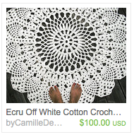
CamilleDesign's listing on Etsy for a cotton crocheted rug
 On first glance, I thought that CamilleDesigns made crocheted doilies, reminding me of my grandmother Lela as she used doilies extensively in her decorating and I inherited many of them.  So of course I had to check it out. 

I discovered - she makes rugs!  Somehow I'd managed to miss the two bare feet at the bottom of the photo.   What a wonderfully clever way of showing the scale and immediately letting people know what they're looking at! 


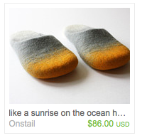
Ramune's felted slipper listing on Etsy

Here, it was simply the title.  Where most of the listings from my search started with "Felted Slippers" or more detailed, "Felted Wool Slippers".  Here we have "like a sunrise on the ocean" - almost a little haiku.  Or the title of a painting.  I could wear a bit of vacation and art every single morning if I bought these!

Search engine optimization recommends including your search terms early, early in your listings.  But what if every once in a while I let poetry take precedence instead? 


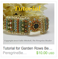
Callie Mitchell's beaded bracelet tutorial on Etsy
With others, threads of story ran through multiple aspects of their Etsy presence.  Callie Mitchell's beaded bracelet tutorial, Garden Rows, is beautiful in it's own right.  The story of her inspiration for the piece made it even richer (told in one short paragraph). 

Her artist bio continued her story as well; far more engaging than a dry recitation of dates and awards.


Don't want to bore you, so just two more call outs.

Steph Cortes' comic, A Girl Can Dream, Right?, listed on Etsy
Since she inspired this treasury, I wanted to include one of Steph's pieces and her comic, A Girl Can Dream, Right? was a perfect fit. 

I love how her listing starts with the story of the comic's origins, segues to the comic itself, then back to it's creation.  All in three short paragraphs.  Nice. 

I caught her at Geek Girl Con and made her sign a copy for me.  She even drew a little self-portrait!


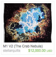
Jimmy McBride's Crab Nebula listing on Etsy

And then the pièce de résistance.  If you only look at one listing, you have to check this one out simply because it's absolutely over the top.  Be sure to take a look at Jimmy McBride's artist profile - that's where it all comes together. 

His entire Etsy experience is internally consistent, even if it doesn't quite match the world as you and I know it. 


Steph Cortes wrote a special little page at the back of my comicSo, there were some of the examples I found.  Do you have any amazing examples of storytelling to share?  Ways of connecting the viewer to the artist or the art work?  I'd love to hear them!  :)

And like an extra scene after the credits at the movies, here's Steph's signature and self-portrait.