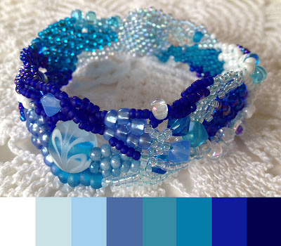
Continuing in my design series, today I'm thinking about monochromatic color combinations. Designing around a single color. The single color works as a strong Unifying element, but since we're only using one color, Contrast has to come from somewhere else.
Truth is, I don't work with monochromatic designs every often. When I do, I tend to make liberal use of Value such as my in Ocean Currents series.
Here, I shade from bright white to deep blues.
I'm also using Undertones to provide additional contrast - with both warm and cool blues. But I've stuck with relatively pure, intense versions of each hue.
 In my Leopard Jasper choker, I shade from a light cream, through dark chocolate, ending on the other end of the value scale at black.
Brown is more often considered a neutral, rather than a 'color' in and of its own right. That said, there's no reason why you can't use it as the focus of a monochromatic composition.
You just have to find interesting enough browns. I combined warm, rich browns with more neutral antique bronze beads (which worked well with the antique bronze button).
 |
| Ocean Currents, freeform peyote bracelet - blue, blue and more blue |
Here, I shade from bright white to deep blues.
I'm also using Undertones to provide additional contrast - with both warm and cool blues. But I've stuck with relatively pure, intense versions of each hue.
 In my Leopard Jasper choker, I shade from a light cream, through dark chocolate, ending on the other end of the value scale at black.
Brown is more often considered a neutral, rather than a 'color' in and of its own right. That said, there's no reason why you can't use it as the focus of a monochromatic composition.
You just have to find interesting enough browns. I combined warm, rich browns with more neutral antique bronze beads (which worked well with the antique bronze button).
 |
| Lariat by Malin de Konig |
Adding Neutrals for Contrast
Malin de Konig graciously allowed me to use the picture at left of her lariat.
In this clean, elegant design, Malin combines a single shade of red with a warm, rich neutral brown and antique brass. I love how it allows the red to sing and take center stage.
Check out Malin's blog post to see additional pictures.
Additional Resources
Looking for other samples of monochromatic compositions, I put together a Pinterest board, aptly named Monochromatic Jewelry Designs, using a number of the pieces from Sally Russick's One Crayon Color challenge from earlier this year.
I love those monochromatic combinations. They are eye catching. I always think of them as "classic" because how could you possibly go wrong?
ReplyDeleteI really like how monochromatics look but I cannot seem to make them happen except in browns. Your blues make me want to try a little harder.
ReplyDeleteGreat choker! These are my favorite colors to work with-the earthtones. A great post too.
ReplyDeleteI love your brown choker. I still drool every time I see it!
ReplyDeleteI have a hard time with monochromatic color schemes in beadwork -- not enough colors of seed beads to pull it off. I should do something about that! I do have fun with it in painting, though.
Great post Karen! It's very nice to follow your philosophizing on the subject. And thank you so much for including me. :-)
ReplyDelete