Analogous Colors are next door neighbors on the color wheel. They go together quite naturally due totheir close proximity. In fact, sometimes it can be hard to decide where one color leaves off and the next begins.
Take the paint color Cadmium Yellow Medium for example. Is it really, truly yellow, or is it orange? My eye tends to say it's the later, especially when compared to the bright, sunny shade of Lemon Yellow.
A quick peak at the two color charts to the right and you'll see what I mean. That's where the 12-step color wheel comes in handy. In my world, I label Cad Yellow Med yellow-orange and count it good.
But from paint mixing terms, you can see that it is a yellow, because when mixed with blues I get a series of green intermediaries, not browns or neutrals (this is something I'll revisit again next week when I talk about complimentary colors).
Cad Yellow Medium and Lemon Yellow are also great examples of warm and cool hues of the same color. I'll let you guess which is which.

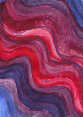
Here are a couple of other Analogous Color Combos from my painted color studies.
Cadmium Yellow Med again, this time paired with Napthol Crimson, which is a fun red with a bit of blue undertones.
The vertical swatch of red in the top right hand color is an unmixed example of the crimson. Mix it with just the teensiest bit of cad yellow and you get the bold red of the horizontal stripe.
So warm and yummy! You could totally turn this into a fall color scheme.
The purples in this mix are quite warm, indicating that both the red and blue had distinct red undertones.
This color combo is very dramatic, and makes me think of Flamenco. Probably because the purply reds make me think of shadows in the ruffles and flounces of a flamenco dress.
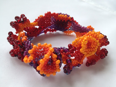
Here's my Spanish Dancer freeform peyote bracelet again. I debated adding it to this post, but I just couldn't write a post about analogous colors and not include it.
It's has an extended range, encompassing half the color wheel from yellow-orange all the way through to violet, but it's definitely an analogous color combo in the ways that the colors flow from one to the other.
And here's one of my little Fancy Fish. I made this one for my husband, so I was going for more masculine colors, so I stuck with the blue/purple sides of the color wheel.
It's almost the same colors as a Japanese fighting fish (except its fins were a deep purple-black) I had in college and I figured, what could be more masculine than a fighting fish?
So now it's your turn? What are some of your favorite analogous color combinations? I'd love to see them.


I have a spread sheet for my Delica beads and I categorize them into major groups, i.e. blue, yellow, brown, metallic, etc... there are some colors like cinnamon or teal that sometimes fit in one group and sometimes in another.
ReplyDeleteAnalogous colors are great bridges when creating.
Isn't it interesting what chameleons some of these colors are? Teal is one of my favorite 'bridge' colors.
DeleteMy favorite analagous color scheme is teal blue and green. I think it works with most skin tones and any season (bordering on turquoise in summer), and it always lifts my day!
ReplyDeleteKaren I love your articles on colour. Even though I thought I "knew" a fair bit about the colour wheel, I always learn so much from your thoughtful reflections and graphic examples. Analogous pairings are troublesome in my medium (polymer clay), especially in canework, as the reduction of images can cause a loss of contrast.
ReplyDeleteHaving played with polymer clay and cane making, I can see how that could truly be a problem - one closely related color blending into the next. Guess your steps would necessarily need to be a little larger, and then allow the eye to make the connections.
DeletePositive site, where did u come up with the information on this posting?I have read a few of the articles on your website now, and I really like your style. Thanks a million and please keep up the effective work. cheap printing services online
ReplyDeleteGreat postt thankyou
ReplyDelete