 |
| A screenshot of TextWrangler in action |
If you happen to have a Mac and are looking for some free text-editing software to work on web pages, I highly recommend TextWrangler by Bare Bones Sofware. It does a beautiful job of contextual mark-up; color coding the code automatically so it's easier to read. Looking at their website, it looks like I'm just barely touching the surface of its capabilities. But back to my web redesign.
My main goals for this overhaul were to:
 |
| my new Classes & Workshops main page |
Update my Gallery pages, adding new work from 2012 and dividing my bead work into similar categories as the single page was growing too long. Also, put my older fabric pieces into gallery archives (they say never delete anything from your website - along these lines one of my most popular pages is on how to set up for freemotion embroidery with your sewing machine). The main Gallery page is still a little stark - I expect I'll add something to it, just not quite sure what at this point. Suggestions are welcome!
Make it easier to find my Kit & Tutorial listings. This was mainly a matter of playing with different names for the navigation link, and adding a few more pages to my website detailing out what I have available. Right now, I have detailed information about my tutorials and kits on my website, but I'm only selling them through Etsy. I have a Paypal account, so hope to sell through skunkhillstudio.com shortly, but I want to make sure I have all the various issues sorted out first.
If you do direct sales through Paypal via your website, I'd love to talk to you about your experiences.
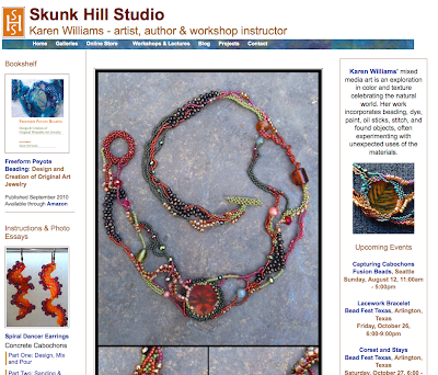
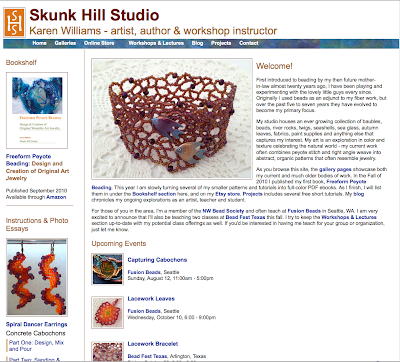
Redo my Home Page. The main page is far and away the most difficult to design, at least for me. Other pages have a specific purpose: Galleries, Classes, etc. The main page needs to be a little bit of everything to everyone, an introduction page and an easy path deeper into the site. So I ended up trying several different home pages.
 |
| The old homepage for Skunk Hill Studio |
 |
| Take one on the new homepage for Skunk Hill Studio - too much text? |
 | |
| New Home Page, less text, blog feed & gallery links above the fold |
I've tested it in a number of different browsers, but if you happen to stop by and notice anything really wonky, would you let me know? It's amazing the differences that can happen when CSS is involved! And thanks for letting me share!
Works well for me. Looks good too.
ReplyDeleteIt does take a long time to do these things, but for the most part it is like working on a good puzzle.